Showing posts with label Business Cards. Show all posts

Wednesday, 20 April 2016

Poster and Business Cards


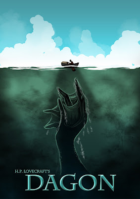
Here's a test I did where elongated the fingers to see if it would make it more eerie.


Poster Iterations

I show a series of business card ideas to Brian and he suggested that I should insider using the sea and sky illustration I made for the poster because it showed a sense of artistic ambiguity.


I don't like the LinkedIn logo's boldness as it is become the first thing to notice at a glance. I could resolve this by thinning out the circular border of the logo.I can also add boldness to the website url to make it stand out more.


Business Cards


Project Overview 

For the exposition, I'll  put together a quick project overview to display at the showcase in the 6th of May. I'll also put together a sign to indicate the significance of my project. 


Thinned out linked in border

Monday, 11 April 2016

Week 14 Development

Monday 

 Today, I updated my poster to share more similarities with my comic's front cover.


Old Poster

On the 5th of April, I uploaded copy of the image on to my Facebook profile to receive some feedback. Some of my peers suggested that I added darker colours to provide the illustration with a Lovecraftian vibe and others suggested that I should change the sky to reflect the oceans. Here is what I created in response to this feedback.


Improved Poster


Poster with ominous night sky

In this iteration, I have added a ominous sky with the gibbous moon. I used blues and cools colours to become harmonious ad allowing the protagonists' boat which features warm colours to stand out.


Business Card Design Front


Business Card Design Back

This card design was to be more affiliated with my project. However I really liked the paper texture which connected with the card materiel. However I feel the illustration on the back would be something else which represented the strengths of illustration.

12/4/16 Brian Meeting

On Tuesday, I requested a meeting with Brian to look over my dissertation. He liked my poster but he suggested that I make the hand a bit more threatening or to leave it as it is to suggest some form a ambiguity and mystery. He also suggested that I include a rim lighting around the figure in the boat to make him stand out more.


Modified Poster

Here is the version with the applied rim lighting. I also included elongated tips onto the creatures fingers to add creepiness. I could also apply the rim lighting to the water as well.

Wednesday

Today was used to rearrange my dissertation to fit Brian's suggestions.I decided to merge the findings and the discussion together to allow me to convey how I applying my findings to my final work. Following today's review of my current dissertation draft and the following have been omitted as they don't seem relevant to an extent.

In the reedited Blue Ray release of the Star Wars Trilogy (2012), one scene in the climax of Return of the Jedi portrays Darth Vader making his decision to turn against his evil master. There was an inclusion of dialogue which may have been used to reflect his thoughts but the delivery made the moment less effective. The original was more effective as it showed him showed him deciding in silence as the music built up to a tense moment emphasising his dilemma (HelloGreedo 2015).

Thursday
I worked on the line work of some of my pages such as page 15 and page 4. My meeting with Brian went well. He was happy with my changes but he suggested that I make further edit to allow me to talk more about my project and how I applied the theory and conventions . At first I was uncertain about the idea but he helped assure me that it would help clean things up as well as reduce the word count. 

Friday
Today, I sent away my dissertation to be checked by a member of student support. After I met up with Sasha, one of the student support staff, He told me that my dissertation was really good despite a few issues with grammar and spelling.

Saturday
After the chosen camera angle was determined, the image was rendered and then placed into Photoshop to be drawn over. Another approach in Maya featured line edges. When producing the environments, screenshots of low poly 3D models created in Maya were implemented to suggest a three dimensional space. However these were drawn over to enhance the traditional look. To accelerate the production process, sketches and final works were produced through digital software such as Adobe Photoshop. Words are also represented as sounds effects and can inhabit a panel’s suggested three dimensional space. In figure 13, the sound effect is placed in the middle ground, suggesting that the panel has its own environment and space which is beyond the border window (Johnson 2006) yet this form of text can also be obstructed by it (Kluthe 2011).

The findings and discussion were altered to fit Brian suggestions. I went through the dissertation and removed unnecessary elements

References
Werner, R. 2014. The Quest Page 6. [image] Available at: http://www.richwerner.com/#/comics/ [Accessed 8 Apr. 2016].

HelloGreedo, 2015. Star Wars Changes - Part 7 of 7 - Blu Ray Changes. [video] Available at: https://www.youtube.com/watch?v=Ot886gTECig [Accessed 7 Mar. 2016].

Friday, 4 March 2016

Progress Presentation: March 3rd 2016

On the Thursday, I had my progress presentation. Here I went through the stages that I have been working on for my project. Some of the weaknesses I had during the talk that I got a bit tongue tied and sometimes had a brief pause. Despite that, my peers and David Lyons appeared to have been happy with my presentation. My peers feedback and critique was quite helpful and allowed me to understand what I needed to work on. Callum Fowlie suggested that I revisited the DOTA 2 Visual guide to help reconsider the colour values of my illustrations. Katriona addressed that my poster had a style that was appealing but it didn't fit the overall style of the comic. Lyons was amazed by my poster illustration with its composition and lighting. However they all agreed that the visual style could changed to be more consistent. I was aware of this but I should have mentioned in the presentation was this was just a rough iteration.


Dagon Minimalist Poster

However I seemed to have answered my peers questions pretty well. After the presentations, I stayed until the end to give other students some feedback.


My meeting with Brain was short but it went well. I pointed out to him some problems I've had and what I am needing to work on.
  • Alter the lighting on a few comics pages.
  • Continue with colouring my pages.
  • Work on my introduction for my Dissertation.
  • Make another print prototype for Thursday.

Wednesday, 24 February 2016

Week 7 Progress

The meeting with Brain went well this week. I showed him some examples of my current progress. I spoke about a few people that I knew from the comic industry who I was thinking about inviting to the showcase. He was kind enough to show us an example of an introduction for a dissertation. He liked my poster design a lot and suggested that I should consider having a similar style or design when I'm implementing my new business card design for the showcase.


Business Card Iterations


Minimalist Poster Design

He continued to add further criticism for my current first page such as how there were a few inconsistency here and there. What I'm needing to work on is my Presentation. I spent Tuesday helping a friend put together a poster for her presidency run. It was good use of small practice for poster design. However she ended up using only a few small elements in her final design.

Tuesday, 16 February 2016

Thoughts for Poster and Exposition in May

With Claire mentioning the final fourth year showcase in the recent lecture, I started thinking about what I will be putting on display for the event. Last year, I managed to take some photos of the previous fourth years' work and I found them to be quite useful for inspiration.


This showcase features the iteration of how a character would look if they become more aligned to good or bad traits in the same way of how you can choose to be bad or good in games.


Jack's work here showed a good collection of pre-production work of his animation project.


I liked Ellen Brown's strong silhouetted poster.


Photos taken from last years Graduate Showcase

Overall, the previous student's work helped give me ideas of how I can layout my work for the showcase and what documentation to put on display.

Ideally, I would like a physical copy of my comic to allow people to take a read through it. It would be beneficial for me to include a small portfolio to allow the look through my work.
One of the stall requirements is the inclusion of an A2 poster that summaries my project. During the presentation with Claire, there were a few examples of how they could look appear. Some of these were movie inspired posters and others were quite minimalist. In previous projects. I have enjoyed working on minimalist art where the shapes are simple but provide an strong impact. I liked the idea of the Jaws inspired poster where one half is the surface and the bottom half shows the monster or threat. So I took some inspiration from films that feature a deep sea threat of some kind. 

I found a comic poster for a Dr Seuss inspired Lovecraft story which had a similar layout.   


Dagon Front Cover (Ivankovic 2013)

Although I have taken elements from this poster such as the bent back posture, composition and lighting contrast, I have adjusted my piece a few times to give off a different approach. I've done this through the use of colour, scale and shapes. The key things I intended to include in this poster was the idea of how man is still small compared to the vast and enormous world that he inhabits. Other element I considered for the poster included key objects such as boat,the monolith, the black mire ,sea life and the Pacific Ocean.

Poster and Front Covers Thumbnails


Poster Iterations

This version was intended to include the monolith. However this made the sea depth look quite shallow and it did not leave a very  large impact. There for this approach will not be used in the final poster design.


I like this iteration the most because we get a strong sense of scale between Father Dagon and the human. Also it is a nice homage to the jaws poster where the figure on the surface is unaware what is coming up from the depths. It allows allows a greater sense of scale for the sea. 

Although the minimalist style is appealing, I'm worried in case it would drift away from my intended art style. I feel that it would be better if I went over these visuals with the loose line artwork I have applied in the comic pages. Therefore the front cover does not provide as false sense of advertising. I've seen in examples of comics where the front covers lack consistency when reading the main comics pages.