Throughout the project, many challenges have emerged.
Maintaining the original story was a key motivation for this project. This was very challenging as some ideas were hard to convey visually. Also as it had a historical setting, this restricted the level of creativity.
Character Designs
With the setting and tone set in the 1910s, I feel like I did not have as much freedom when designing characters.I was able to use visual research pretty well.The character designs depicted the key figures such as the protagonist and Father Dagon. Another character, The Ethnologist from the short story was replaced with a hospital doctor to enhance the flow of the comic page as he was involved in more than one panel. The characterisation of the protagonist, featured the elements of a man whose life deteriorates. This was successfully reflected in his appearance and expression. The palettes of emotions expressed through his facial expressions and body language were readable, however his posture could have been improved.
Father Dagon’s body language and facial expression proved difficult to portray. Fortunately there was the ability to provide some expression and personality through the creature’s eyes. All their distinguishing silhouettes were effective and consistent. However the consistency of the protagonist’s appearance was very challenging and various character designs could benefit from revision and reiteration as their figures and colour scheme did not stand out as expected. This was the result of focusing on the comic pages rather than the preproduction documentation.
Case Studies
When writing the case studies, I had some difficulty trying to summarise each comic. In the en I managed to complete 4 of my intended case studies. In hindsight, the mediums I was planning to analyse did not have much to act as full case studies. Nevertheless the material from them did help with my research such as how that bar scene from the Shining (1985) showed a good use of hand gestures and body language. and how the film featured a strong use of symmetrical composition.
Comic
The ideas convey in the comic were effective. I'm pleased how I was able to highlight the key scene from the story. Maintaining the original story was a motivation for this project. The intention to keep it as true as possible to the story was very challenging as there were difficulties with visually conveying ideas, originally discussed in the short story.
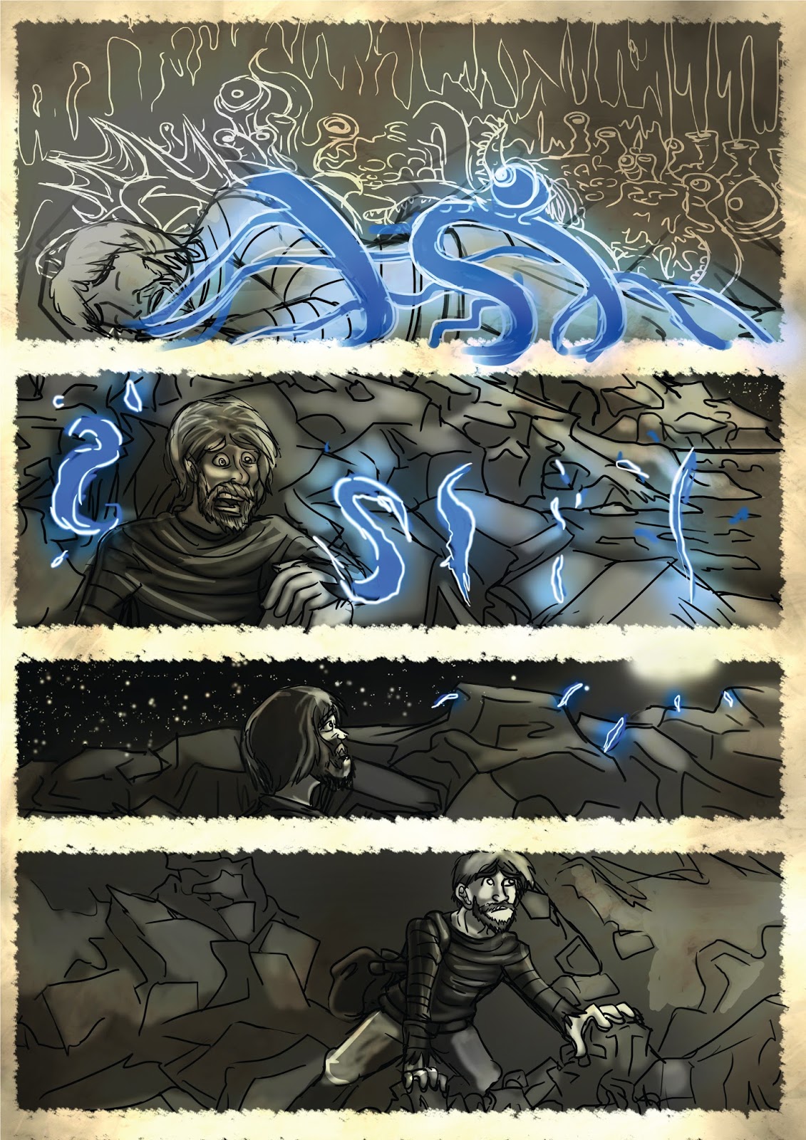
Some of the problems that have surfaced was the fact that some panels did not provide enough information about what was happening. For example in page 17, there was originally two panels, one of the man running across the landscape and in the next shot showing him sitting under the boat as it begins to rain. One of the issues addressed was what happened to the monster and was that was pursuing him the previous page. His was fixed through the addition of panels. Ambiguity helped with helped with the suspense. The intention was that although the creature failed to catch the protagonist, he would be pursued mentally. The lack of visuals of the monster reinforces this. Within the final artefact, this was executed because some of the original source material was difficult to implement in a way where the ideas could be conveyed through visuals. The scene that was removed from the comic was the part where the protagonist sits down holding his nose to cover up the odour while theorising how this black wasteland appeared. The theory was indicated by a diagram in a thought bubble to show that the protagonist was thinking.
“As I crawled into the stranded boat I realised that only one theory could explain my position. Through some unprecedented volcanic upheaval, a portion of the ocean floor must have been thrown to the surface, exposing regions which for innumerable millions of years had lain hidden under unfathomable watery depths.” (Lovecraft 1919 p. 23–29)
This was removed not because I was uncertain of an appropriate way to illustrate him thinking about this theory. It was that it was a theory that did not get mentioned later on in the story.
The challenge of providing a sense of sense of depth and an appropriate impact of a scene was a recurring theme. In page 16, the protagonist runs away from Dagon. Originally the visuals did not convey this effectively. The tonal values were altered drastically to allow the sense of space and depth to be conveyed.
Initial sketches produced, which were evaluated by peers, were discarded as they did not provided enough clarity. A careful iterative process added elements to address this.
Through text limitations, panels were added or subtracted to generate clarity. For example in page 17, the original two panels featured the protagonist running across the landscape then sheltering under the boat with no evidence of the monster pursuing him. This was corrected through the addition of panels where the monster was represented ambiguously, thus maintaining the suspense.
Omitting panels was necessary as the original source material featured elements which were challenging to convey through visuals alone. One scene removed was where the protagonist had to theorising how this black wasteland appeared. The theory was initially indicated by a diagram in a thought bubble. This was removed as it was too complicated to imply.
During the production process, the idea of conveying disorientation with the main protagonist during a key scene was considered though carefully design page layouts involving rotation. However this approach was discarded proving to the reader’s engagement with the comic’s story, it was eventually rejected.
Was the project Artefact Successful?
The artefact was bale to highlight remains event of the story and was able to convey these with little words as possible. Omitting of comic pages and panels were made because one of the ideas that was being deceived visual as the idea of how the black mire came to be. However the visuals were very unclear and challenging to visualise in a single panel. Therefore it was decided that the thought bubble was to be removed with this visual detail. I feel that the use of tone could have been further developed. The project was successful in allowing illustrations to summarize detailed descriptions of key scenes. The choice of panel sizes allowed for key scenes to be visually highlighted.
The project was successful in allowing illustrations to summarize detailed descriptions of key scenes through the use of appropriately scaled and shaped panels. However certain panels of pages lacked clarity. This was overcome though the placement of elements or the addition of lighting to allow enhanced focal points.
Future Approach
Although tonal value was implemented into the artefact, it required further investigation. The interaction between bordered and non-bordered panels is an area which also could be further developed. In a further possible revision, a page could contain bordered and border-less panels and be able to enhance scene and mood. Since the story was written in first person, with a featureless protagonist, the comic could have been visually portrayed in the first person perspective. This perspective was previously portrayed effectively in Watchmen (Moore 1985) and Daybreak (Ralph 2011). However for this work, as character design was incorporated, the second person perspective was more appropriate.
I found this project to be challenging but I am glad that I have managed to complete my final project. The comic has made drastic changes since the beginning of four year.