Showing posts with label Colours. Show all posts

Wednesday, 20 April 2016

Protagonist Character Development


Protagonist Mood Board

Based on this mood board, the protagonist has had various depictions in each version. He has been depicted wearing a naval uniform. Other variations depict him with a worn shirt, braces and trousers.


Character Iterations 

To reflect the short story, I looked at how he began as a merchant officer. Therefore I looked at merchant officer for the 1910s. this was helpful as it allowed for me to include additional detail to the final design. 


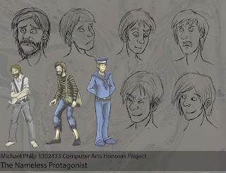
Head Iterations

I went through a series of head iterations. I planned to have the protagonist beginning in as a sophisticated naval officer. However, over the course of the story, his spirit and appearance begins to deteriorate. This was conveyed through the character worn out attire and  growth of facial hair.


Before and After Incident


This mock up of a model sheet depict the character with his various facial expressions and attire.

The three attires the protagonist wears throughout the the story

Colour Choice

Colour was also used to highlight the character’s personalities. The protagonist’s red shirt was affiliated with warmth and comfort as it suggests attachment to his past. The blue trousers suggests a sense of loss and detachment (Pardew 2008) which was demonstrated through his troubled times. It was decided that the protagonist would be incorporated in the page’s chosen visual style whereas the antagonist emits a green/blue glow and is not restricted to the page’s established colouring style. Maintaining the original story was a key motivation for this project. This was challenging as some ideas were hard to convey visually. Also as it had a historical setting, this restricted the level of creativity. The artefact’s characters reflected the story’s setting and wore appropriate outfits to reflect their roles.


Final Model Sheet of Character

The consistency of the protagonist’s appearance was challenging and various character designs could have benefitted from revision and reiteration as their figures and colour scheme did not stand out as expected. This was the result of focusing on the comic pages rather than the preproduction documentation.

Wednesday, 23 March 2016

Week 11: Practical Work

After my meeting with the printing service at Dundee University, I found out for the printing service that:
  • I just need to to submit a pdf of the entire comic.
  • The price for one copy is £ 7 coloured.
  • It would take a day when it is not busy.
  • The layout just needs top be one single page layout.
I worked on some adjusting some comic pages based off yesterday's feedback from Brian.


Page 16 Before Modification

Some of the issues with this page was the protagonist and the level of depth. Brian's advice was to try and bring him closer with a darker silhouette.


Page 17 Before Modification


Page 17 After Modification

The extra panels help provide additional clarity and the last set of panels does help suggest the idea of  disorientation and ambiguity as we have no idea what is approaching the protagonist.


Page 18 Before Modification


Page 18 After Modification

Here, I replaced the sea captain's position with the doctor but I kept him in the background to suggest that he helped rescue the protagonist.


Page 19 Before Modification


Page 19 After modification


I altered the perspective of the monolith and in doing so I actually made the perspective of the scene look greater.


Page 22 Before Modification

Page 22 After Modification

This layout for Page 22 features all the familiar elements from the original version is more angular,suggesting more dynamic movement. There is a triangular composition. However this composition is a lot more cluttered compared to my previous iteration. It is likely that I will stick with my original piece.

Monday, 14 March 2016

Inside Cover Development

In several comics I've looked at ,they include an additional page with credits at the beginning. So I chose to apply a similar approach with my comic. I wanted to continue with the use of teh textured visual style,which has been applied for the flash back sequences.


This is one of the earliest attempts of this was the image below.


Attempt 1


Attempt 2

I liked the strong silhouettes in the second attempt. However It appears to be too flat. After looking at This 2.5 dimensional panning from this showcase.


Dark Forest Assets video


Current Attempt

This latest attempt shows a greater improvement in the depth through the use of atmospheric perspective. Its needing a few more tweeks but it it still looks better than before. I managed to put together a double page spread to use for the inside pages for the comic.


Double Page Spread

Sunday, 28 February 2016

Batman:The New 52 Analysis

In the first volume where Batman encounters the Court of Owls, there is a technique which I noticed while reading. There is a series of pages where the panels are altered 90 degrees per page until they return to their original state. I found this to be quite effective as Fey (2012) says that this was the author and writer's way to illustrate Batman's sense of disorientation as well as reflect his distorted mind as he travels through their lair.
I would like to apply this at an important scene in the story where the protagonist encounters Father Dagon and it's monolith. My idea is to begin with the scene were the protagonist encounters the monolith which will be orientated in the correct position at 0 degrees.The next page will be at a landscape orientation at 90 degrees. The page with the appearance of Father Dagon will be positioned upside down at 180 degrees and then the next page after that,will be another landscape picture, This time it will be at 270 degrees.
Finally the scene where the monster spots the hero and as he runs away, the orientation will come full circle as a way to reflect the hero's disorientated mind and to further enhance the line for the story;

"I think I went mad then." (Lovecraft,1919, pp.23-29)

Here is a test of what to expect.


First Page


Second Page


Third Page


Fourth Page
References
Fey, E. 2012. Batman: Court of Owls (New 52) Volume 1 (2/2). [Blog] Era Fey Gossips. Available at: http://erafeygossips.blogspot.co.uk/2012/11/batman-court-of-owls-new-52-volume-1-22.html [Accessed 27 Jan. 2016].

Lovecraft, H.P. 1919. Dagon. The Vagrant. (11): pp.23–29.

Wednesday, 27 January 2016

Morphine Side Effects

Since the main charter is using morphine as a way to ease this pain that he is suffering from after his experience in the pacific, I wanted to make sure that I represented the effects of Morphine appropriately.
Morphine can occasionally create hallucinations. The patient can feel drowsy if he is overdosing.

According to drugs.com (2016), there are several side effects that occur when taking morphine;
  • Abdominal or stomach pain 
  • blurred vision 
  • bulging soft spot on the head of an infant 
  • burning, crawling, itching, numbness, prickling, "pins and needles", or tingling feelings 
  • change in the ability to see colors, especially blue or yellow 
  • chest pain or discomfort 
  • confusion 
  • cough 
  • decreased urination 
  • dizziness, faintness, or lightheadedness when getting up suddenly from a lying or sitting position 
  • fainting 
  • fast, pounding, or irregular heartbeat or pulse 
  • headache 
  • hives, itching, or skin rash 
  • increased sweating 
  • loss of appetite 
  • nausea or vomiting 
  • nervousness 
  • pounding in the ears 
  • puffiness or swelling of the eyelids or around the eyes, face, lips, or tongue 
  • severe constipation 
  • severe vomiting 
  • shakiness in the legs, arms, hands, or feet 
  • shortness of breath 
  • slow heartbeat 
  • sweating or chills 
  • wheezing 
  • cold, clammy skin 
  • flushing or redness of the skin, especially on the face and neck 
  • irregular, fast or slow, or shallow breathing 
  • lightheadedness 
  • loss of consciousness 
  • low blood pressure or pulse 
  • pale or blue lips, fingernails, or skin 
  • pale skin 
  • pinpoint red spots on the skin 
  • pounding in the ears 
  • shakiness and unsteady walk 
  • unsteadiness, trembling, or other problems with muscle control or coordination 
  • unusual bleeding or bruising 
  • very slow heartbeat

I had elements of these symptoms in my mind when I was designing protagonist's morphine endosed appearance.

At the moment, I'm needing to revisit this design as he only partially shows  some symptoms of morphine side effects.
 I think it would be appropriate to suggest that he could be making overdoses.
With that in mind I found these additional symptoms that occur when he is overdoing on morphine,
  • Constricted, pinpoint, or small pupils (black part of the eye) 
  • decreased awareness or responsiveness 
  • extreme drowsiness 
  • fever 
  • increased blood pressure 
  • increased thirst 
  • lower back or side pain 
  • muscle cramps or spasms 
  • muscle pain or stiffness 
  • no muscle tone or movement 
  • severe sleepiness 
  • swelling of the face, fingers, or lower legs 
  • weight gain
In the final comic, I was panning on including a section where the main protagonist takes the drug and we see that the effects cause these haunting shadows to disappear while he is surrounded by faint cloud of multiple saturated colours to show that he is defended by a barrier.
In the Dagon comic adaption featured in  Lockwood's The Lovecraft Anthology (2011) ,there is a use of saturated water colors that give the impression of the ways hat morphine can alter your vision to see certain colours. To help connect it with madness the imagery does show chaotic elements like how some ink blots drip down into the next panel.

Images from the Lovecraft Anthology Volume 1

Here is a scene form my comic which will be the protagonist taking morphine to allow him to be free of haunting imagery.

Comic Page Sketch


Refined Comic Page

References

Drugs.com, 2016. Morphine Side Effects in Detail - Drugs.com. [online] Available at: http://www.drugs.com/sfx/morphine-side-effects.html [Accessed 27 Jan. 2016].

Kaye, P. n.d. Hospice World. [online] Hospiceworld.org. Available at: https://www.hospiceworld.org/book/hallucinations.htm [Accessed 27 Jan. 2016].

Lockwood, D. 2011. The Lovecraft anthology. London: SelfMadeHero.

Monday, 18 January 2016

Artists and their styles: Grant Gould

Today, I was looking through an art magazine which was about Star Wars inspired work by artists. One of these artists was Grant Gould, who is a freelance comic artist who has worked for Lucasfilm, Topps and the Klutz books.He has also made his own comic, Wolves of Odin and RPG, Blade Raiders. His art style appealed to me because I like the comic styled artwork that he has produced.


Star Wars Illustrated ESB: LUKE SKYWALKER (Gould, 2015)


Star Wars Illustrated ESB: YODA (Gould 2015)

Wolves of Odin BOOK 2 NEWS by grantgoboom

Wolves of Odin BOOK 2 NEWS (Gould 2011)


Elven Druid Character (Gould, 2007)

BLADE RAIDERS: EXODUS Fantasy Novel by grantgoboom

BLADE RAIDERS: EXODUS Fantasy Novel (Gould, 2013)


 STAR WARS REBELS: Sabine (Gould, 2014)

Style Traits

They way he draws people are in a semi realistic proportions. however the use of colours are used simply and the lighting is minimalist. The shading especially is soft and simple. However his art style can vary as is shown in an picture he did of a Elven Druid.

His latest Star Wars art pieces involve overlaying colour such as that of the character's light sabers or blaster projectiles. This overlaying colouring also affects the linework by giving it a faint hue and can help suggest depth within the picture. In the comic cover of his comic Blade Riders (2013), he has the protagonist highlighted in a warm colour while the other characters on the cover are covered in a cool green hue. The cover itself also has a textured overlaying the artwork. Based on the feature of melee weapons and armour it would be safe to assume that this is a fantasy comic. When he is drawing characters that are from the Clone Wars TV show, he preserves their unique art style. 


Star Wars Illustrated ESB: HAN SOLO (Gould 2015)

Composition

While many of his single print works consist of a single character with a background, he has various types of pictures such as head shots of certain characters from popular culture and. He also has examples of work where he has more than two characters and these pictures often contain a story or situation. He also has used a tilted camera angle for effect. He includes additional visual effects when needed.

Subject of work

His artwork based on his Deviantart Profile consists of fan art work form popular culture such as Star wars, Lord of the Rings, Saturday morning cartoons and DC comics. He has also done work for comics such as the Wolves of Odin. http://grantgoboom.deviantart.com/art/Wolves-of-Odin-BOOK-2-NEWS-217597771#
Please note that this information is based on my observation of his works through the links I has supplied.

References

Gould, G. 2007. Elven Druid Character. [image] Available at: http://grantgoboom.deviantart.com/art/Elven-Druid-Character-64151587 [Accessed 13 Oct. 2015].


Gould, G. 2013. BLADE RAIDERS: EXODUS Fantasy Novel. [image] Available at: http://grantgoboom.deviantart.com/art/BLADE-RAIDERS-EXODUS-Fantasy-Novel-414006037 [Accessed 13 Oct. 2015].


Gould, G. 2014. STAR WARS REBELS: Sabine. [image] Available at: http://grantgoboom.deviantart.com/art/STAR-WARS-REBELS-Sabine-436440464 [Accessed 13 Oct. 2015].


Gould, G. 2015. Star Wars Illustrated ESB: HAN SOLO. [image] Available at: http://grantgoboom.deviantart.com/art/Star-Wars-Illustrated-ESB-HAN-SOLO-530364802 [Accessed 13 Oct. 2015].


Gould, G. 2011. Wolves of Odin BOOK 2 NEWS. [image] Available at: http://grantgoboom.deviantart.com/art/Wolves-of-Odin-BOOK-2-NEWS-217597771# [Accessed 13 Oct. 2015].


Gould, G. 2015. Star Wars Illustrated ESB: YODA. [image] Available at: http://grantgoboom.deviantart.com/art/Star-Wars-Illustrated-ESB-YODA-530365571 [Accessed 13 Oct. 2015].


Gould, G. 2015. Star Wars Illustrated ESB: LUKE SKYWALKER. [image] Available at: http://grantgoboom.deviantart.com/art/Star-Wars-Illustrated-ESB-LUKE-SKYWALKER-530365285 [Accessed 13 Oct. 2015].


Friday, 8 January 2016

Christmas Holiday Drawing Practice

I used the holidays as an opportunity for me to draw some artwork. After I saw the new star wars film. I began to develop some artwork of the Antagonist Kyla Ren. I liked the character for his appearance. Although he looked very much like Darth Vader in the previous movies, I did like how his design looked quite simple. I can understand why the film makers wanted him to be a very complex charter however form a different perspective he is basically a emotional stereotype based on his emotional and tempered performance in the film. The only difference is that when  he takes off the helmet it feels like a completely different character. While it is a nice change, it feels somewhat out of place. Furthermore in this iteration of the character he looked  like Jon snow from the HBO TV show Game of Thrones if he was a dark Jedi.I began this practice with a speed paint of the charter. It was an attempt to work on my skills in figure drawing. I drew Kylo in a superior pose with his saber out ,looking down at the viewer with head tilted upward and smiling quite menacingly.


First Attempt


Refined Line Art


Coloured Art


Flipped Character with Background


Flipped Final Version


Satirical Illustration

While I was in the mood and influence of the film I drew some doodles as a way to satirise the character. In the film, he was portrayed as a powerful individual but with a weak and unstable mind. I drew the character in a comic style playing the Mobile app, Flappy bird which has a reputation to be a frustrating but simple game. I tried to establish a scenario where the character would. I was inspired by some comics I found on Tumblr which satirized the characters's behaviour and personality. What amazes me is how quickly these out just after the film's release.


So I decided to include some exaggerated expression for the characters. The main reason I thought I would include these on this blog is because these brief exercises allowed me to warm up my skills in drawing figures and expressions for the start of this semester.

Wednesday, 6 January 2016

Father Dagon Model Sheet Development


Rough Layout of Model Sheet

I spent some time just after the first semester working on the model sheet for father Dagon. I wanted to to use this as a form of reference for my model. At the moment, the placement of the scales on the belly are inconsistent based on this first version.
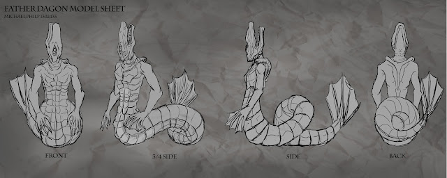

Defined Model Sheet


One of the biggest challenges I have had with this design was the mouth being on the top of the head rather than the from of the head. It was not only to fit the sea serpent illustration I used for inspiration as well as a misinterpretation of the Dagon fish god illustration, it was also used to confuse the reader, In H.P Lovecraft's other work, there are references to beings which have no definitive form such as the Shoghooth from "At the Mountain of Madness". In addition, it connects with the concepts of the familiar within the unfamiliar as I have referenced fish traits and other marine animals.
Further more there is a fear factor with the one eye and unhuman qualities of the creature's anatomy.

Monday, 16 November 2015

Father Dagon Colour Iterations

During my exploration the Dagon creature, I decided to look into some various colours schemes that would fit its appearance. Since it was a creature of the ocean, I aimed to give it a colour scheme which featured a cool colour palette.

Grayscale and Scale Comparison

Various Colour Scheme Iterations

I considered the idea of using an inverted effect to suggest that this creature was not native of this world. In the end, I have chosen that I will go for a more suitable colour scheme which follows the colour scheme of blue, red and yellow. I have decided to include and overall blue and glow to amplify its appearance in the comic.