Showing posts with label Character Design. Show all posts

Wednesday, 20 April 2016

Protagonist Character Development


Protagonist Mood Board

Based on this mood board, the protagonist has had various depictions in each version. He has been depicted wearing a naval uniform. Other variations depict him with a worn shirt, braces and trousers.


Character Iterations 

To reflect the short story, I looked at how he began as a merchant officer. Therefore I looked at merchant officer for the 1910s. this was helpful as it allowed for me to include additional detail to the final design. 


Head Iterations

I went through a series of head iterations. I planned to have the protagonist beginning in as a sophisticated naval officer. However, over the course of the story, his spirit and appearance begins to deteriorate. This was conveyed through the character worn out attire and  growth of facial hair.


Before and After Incident


This mock up of a model sheet depict the character with his various facial expressions and attire.

The three attires the protagonist wears throughout the the story

Colour Choice

Colour was also used to highlight the character’s personalities. The protagonist’s red shirt was affiliated with warmth and comfort as it suggests attachment to his past. The blue trousers suggests a sense of loss and detachment (Pardew 2008) which was demonstrated through his troubled times. It was decided that the protagonist would be incorporated in the page’s chosen visual style whereas the antagonist emits a green/blue glow and is not restricted to the page’s established colouring style. Maintaining the original story was a key motivation for this project. This was challenging as some ideas were hard to convey visually. Also as it had a historical setting, this restricted the level of creativity. The artefact’s characters reflected the story’s setting and wore appropriate outfits to reflect their roles.


Final Model Sheet of Character

The consistency of the protagonist’s appearance was challenging and various character designs could have benefitted from revision and reiteration as their figures and colour scheme did not stand out as expected. This was the result of focusing on the comic pages rather than the preproduction documentation.

Monday, 21 March 2016

Revisited Model Sheets: Father Dagon

I made some changes to my original Dagon designs so I had to modify the model to reflect these changes.


Before 


After

To provide a reference to the uncanny valley, I decided to add the two eyes at both sides with the addition of a gill at the front in the shape of a mouth. This would help with the idea of symmetry but it also shows the deception of this creature. It could be argued that people who saw this creature mistook it's front gill as a mouth . The funnels on its shoulders can be used as a defense mechanism where it can blind its prey, or pride additional means to gain acceleration when swimming. However I think I will need to modify the front view's head a bi to make it look like it is looking straight. The front profile of Father Dagon did not look straight on so I decided to fix that.


Revised Model sheet

Wednesday, 16 March 2016

Developed Final Characters: Sea Captain and Ethnologist

I was unsatisfied with my development for the characters which I produced for this comic last semester. Although I was happy with the designs I made for the comic, they felt more like throwaway characters since they only appeared in one page.


Sea Captain and Professor Mood Board

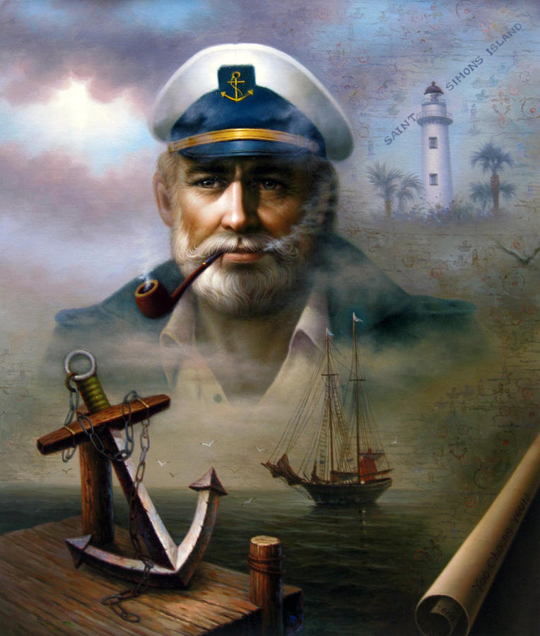
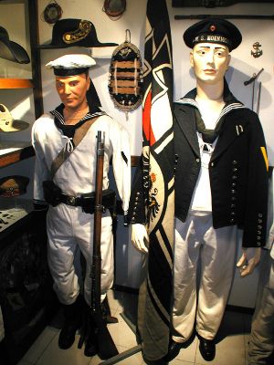
To begin with I researched university professors from america including sea captains from the 1910s to get an understanding of their attire. This mood board also features images which inspired the final German sailor uniforms.

Ethnologist and Sea Captain Sketch
Ethnologist and Sea Captain Line work

Ethnologist and Sea Captain Line work Coloured


Ethnologist and Sea Captain with Grayscale 

For the characters, I wanted to have an appropriate contrast as the sea captain will have blue colours to reflect his affiliation with the sea.I used an orange hue for his turtleneck to show his warm and comfort ans he was kind to rescue the protagonist from the ocean.I applied some traits of a sea caption such as the use of a jacket and a cap. I also included a pipe that he would puff on. The final character was depicted without his hat but he wore his jacket when he visits the protagonist in the hospital. I altered some of the values to allow stronger focus on the pints of interest on the character. I also used a gradient to help with this.


Early Designs

I showed the designs to my supervisor, Brian. He suggested that I altered the ethnologist figure to look like his suit is more fitting for the 1910s era. In addition, his right should was lower than his right shoulder. In the following image, I made the changes to the character.


Altered version of characters

 References

Referenced on 26/11

http://images.fineartamerica.com/images-medium-large-5/saint-simons-island-sea-captain-2-yoo-choong-yeul.jpg

http://www.pallant.org.uk/images/the_blind_sea_captain_0.jpg

http://plimmerton.org.nz/assets/History/CaptainHooper1914.jpg

http://www.thepirateslair.com/images/german-kriegsmarine/1917-inspection-ditty-box.jpg

http://s400910952.websitehome.co.uk/germancolonialuniforms/militaria/photos/marine3.jpg

http://www.thehistorybunker.co.uk/acatalog/German_Uniforms_for_hire.html

http://www.rootsweb.ancestry.com/~innwigs/ImageArchive/VU/Faculty/VU-John_H_Cloud-PhysicsProfessor-1914-SS.jpg

http://exploreuk.uky.edu/catalog/xt7sf7664q86_3243_1

http://static-content.springer.com/image/art%3A10.1007%2Fs12210-015-0444-z/MediaObjects/12210_2015_444_Fig1_HTML.jpg

Saturday, 16 January 2016

Week 1 Weekend - Book Design

During this weekend, I took some time to work on the front and back cover for the comic. If I go ahead and get a printed form of the comic then I could allow people to read it in a traditional way. However If I am unable to do so then I aim to have a digital form available so they they can read it.

Early Thumbnails


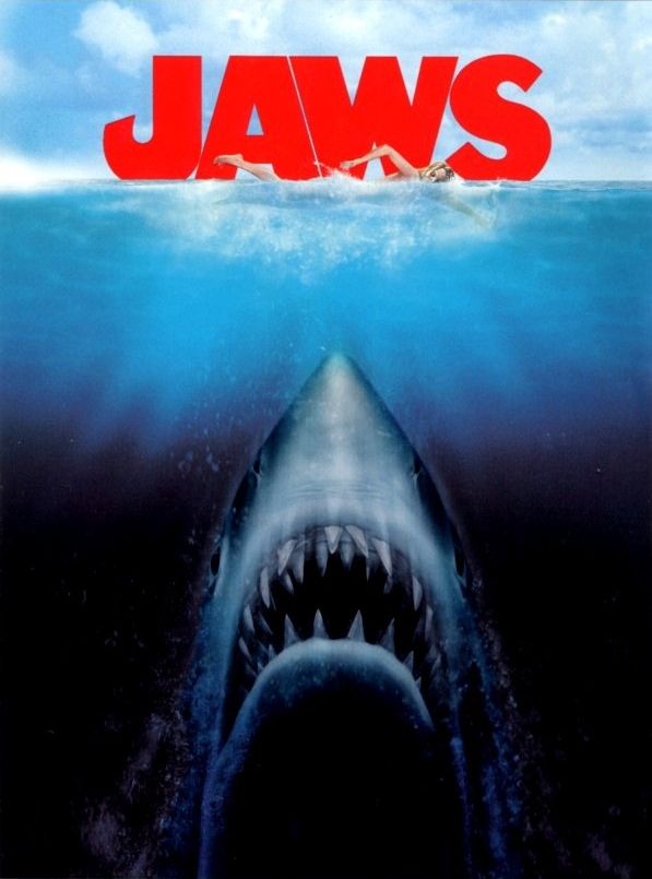
While I do like the way this is laid out with the ocean at the top with the eye underneath. The way the eye looks inappropriate.The inspiration for this thumbnail was from an old VHS cover of a b-movie called "Evil Beneath Loch Ness". 


 Front Cover Iterations


Rough Silhouette of the Front Cover

Eventually, I decided to go from this illustrated version where there is a large silhouette of a humanoid hand reaching up to the underbelly of a rowing boat. For this illustration I wanted to make sure that the boat and the large hand were the key focuses. I took some inspiration for this thumbnail from a few sources.


Depth and sea monster Influence

I also considered using a Lovecraftian styled frame for the illustration the front cover cover. However I spoke to Brian about this and he told em the way i had designed the frame appeared  more older than if it were made in 1914. He suggested that i took a look at some painting in the local museum that were amide in 1914 and observe their framing. Never the least I designed the frame like this to reflect the themes the recurring themes of Lovecraft such as tentacles,eyes, fins and other familiar traits used unfamiliar ways. Furthermore another theme that occurs is that Lovecraft's often present to people a indefinite form.In other words, no one whats the creature's true form looks like or that it keeps changing its form. I also included some marine traits like barnacles and fins and scales.


Lovecraftian Frame Sketch


 Lovecraftian Frame Line Artwork


Hand Iterations


Hand Iterations

 Here are some further iterations into how teh and could look. I found it quite challenging because I wanted to make sure the hand looks human like but had extensive features that are not often associated with humans such as the use of webbed hands and elongated fingers. I also wanted to include the use of pointy finger tips to emphasis the long fingers and add a bit of creepiness.


Front Cover Iterations

Here I elongated the hand to fit he Original final design of the creature plus it helps fit the eerie and mucky atmosphere for the water.


Back cover Design Development

For the back cover, I want to it to feature an illustration which reflected an opposite mood.However I wanted there to be a connect  between the two covers through the use of environment and colour. I revisited one of the thumbnail I made earlier and I development on it further.

 Rowing Boat Sketch


Rowing Boat Coloured


Boat Reduced

The small size of the man in the rowing boat does help provide a sense of scale and shows how small he is in this large and wide ocean. I decided to include some grey and blacks clouds  as a form of o foreshadowing the nightmares that the main character will encounter. Furthermore the use of colour and more positive lighting is a suitable contrasts compare to the front cover.


Frontcover  Illustration on top of Book Texture

https://www.flickr.com/photos/potatojunkie/4530265001/in/photostream/

However I plan to find old books that I possess which may be appropriate for displaying old styled book.


Photos of Book Textures

With these book textures applied to the front cover illustration, it will help give the comic a sense of age.