Friday 25 December 2015

Art Inspiration: Tony Moore

I would say that one of my influences on my current style would have to be on Tony Moore.
I ready Robert Kirkman's first volume of the Walking Dead comic series and I really enjoy seeing Tony Moore's art style. I liked the simple gray tone artwork while it used realistic proportions. While incorporating exaggerated facial expression and head shapes. I feel that his art style like make me think of the walking dead because I have also ways of affiliating zombie themes with dark and realistic styles aimed at adults. However there I found it to be quite a contrast where there were realistic elements in he character's anatomy but the expression the characters made it feel a little bit cartoonish with it being aimed at that audience demographics. I particularly like the approach does to make the heads show unrealistic and exaggerated traits while maintaining a realistic proportions in the overall anatomy of the character. Some of the thing I like was the ways he drew heads and the eyes. they are not larges but small in relation to the realistic proportion of the human head. The use of expressions helps make the body language more readable as expressions in realistic styled comics are not so readable. In his work, there is great sense of detail and emphasis the line work despite the limited lighting and colouring in the comics pages. However he does other work. His male characters can have large square chins and jaws. The line work incorporated exaggeration style allowing the drawings to be more dynamic. When he draws animals he incorporates more realistic proportions bust allow room for expressions. He works using traditional inks and markers but he has also done proper colouring. He uses the soft tones to suggest lighting and depth to his two dimensional drawings.


The style has been adapted to The Walking Dead games by Tell Tale games (2012).


Deadpool #1 Cropped Preview (Moore 2012)


Tony Moore – The Walking Dead (2013)


Fear Agent (Moore and Sollazzo, 2008) 

In an online interview with Optimiumworld (2008) he talks about his processes and techniques and uses. When inking Tony Moore used sharpies pens when focusing on negative drawings and to make small corrections in his work. He uses traditional method sinking his work. He explains his production process when creating a comic page. First, he reads his client’s brief/script then creates a 2 by 3 inches drawing. Second, we then scans into Photoshop to adjust the panel and gutter layout. The reason he works in a small scale is to allow to him to concentrate more on the story itself and not on the minor details. Third, after he has printed out the sketch onto a 10” by 15” inch sheet, he goes over the printed lines in pencil. There have been occasions where he just does the penciling then gives it to an inker. Once the inking is complete he scans them onto the computer. Here I manged to do a small test to see if I could apply his style to my work.


Tony Moore Visual Style Test

References

Moore, T. 2016. Original Art. [online] TONY MOORE ILLUSTRATION. Available at: http://www.tonymooreillustration.com/shoporiginalart/ [Accessed 25 Jan. 2016].

Moore, T. 2013. Tony Moore – The Walking Dead. [image]. Available at: http://www.comicartfans.com/gallerypiece.asp?piece=1044856 [Accessed 30 Nov. 2015].

Moore, T. 2012. Crop-Deadpool_1_Preview41. [image]. Available at: http://geek-news.mtv.com//wp-content/uploads/geek/2012/10/crop-Deadpool_1_Preview41.jpg [Accessed 30 Nov. 2015].

Moore, T. and Sollazzo, A. 2008. Fear Agent. [image] Available at: http://alexsollazzo.deviantart.com/art/Fear-Agent-90723765 [Accessed 30 Nov. 2015].

Thibault, J. 2008. Masters of Ink #10 - Tony Moore answers 12 questions - Optimum Wound. [online] Optimum Wound. Available at: http://www.optimumwound.com/masters-of-ink-10-tony-moore-answers-12-questions.htm [Accessed 25 Jan. 2016].

Thibault, J. 2008. Words and Pictures with Jacen Burrows - Optimum Wound. [online] Optimum Wound. Available at: http://www.optimumwound.com/words-and-pictures-with-jacen-burrows.htm [Accessed 25 Jan. 2016].

Thibault, J. 2008. Masters of Ink #10 - Tony Moore answers 12 questions - Optimum Wound. [online]. Optimum Wound. Available at: http://www.optimumwound.com/masters-of-ink-10-tony-moore-answers-12-questions.htm [Accessed 30 Nov. 2015].

Kirkman, R. and Moore, T. 2004. The Walking Dead. 12th ed. Berkeley, CA: Image Comics.

The Walking Dead: Season One. 2012. [computer game]. Xbox 360. Telltale Games.

Thursday 17 December 2015

Digital Tutors Lesson: Line Art in Illustrator

Last night, I sat down and watched a lesson on Digital Tutors to look for tips on how I can  improve my line art skills in Illustrator. I have been used to applying simple brush but I wanted to look at others ways to make effective line work.
  • The width tool create width points and then modify them.
  • The Alt key and modify the point of the width
  • duplicate using the alt key
  • can save it as a stroke profile
  • sue the pen tool to create paths on the drawing
  • Use pathfinders to make interesting shapes.
  • One way to make like work is to make a shape using the pen tool then duplicate that shape then scale it down. 
  • Make some minor adjustments to the rescaled shape depending on  the light source.

Scott McCloud Quotations

The following Quotes are from Scott McCloud's novels about Comics. I may use these for my Dissertation.

Understanding Comics by Scott McCloud (1994)
"the invisible world of senses and emotions can also be portrayed either between or within panels" (McCloud 2006 p.121)

"just as pictures and the intervals between them create the illusion of time through closure, words introduce time by representing that which can only exist in time - sound." (McCloud 2006 p.95)

"our eyes have been well trained by the photograph and by representational art to see any single continuous image as a single instant in time. " (McCloud 2006 p. 96)

" The panel acts as a sort of general indicator that time or space is being divided" (McCloud 2006 p.99)

Scott talks about how a panel if I bleeds into the edges of the page it can give the scene a timeless atmosphere as it established s the location. (McCloud 2006 p.103)

"Now if pictures can, through their rendering represent invisible concerns such as emotions and the other senses"

"then the distinction between pictures and other types of comic like language which specialize in the invisible may seem a bit blurry."(McCloud 2006 p.127)

" one represents a visible phenomenon, smoke while the other represents an invisible one, our sense of smell. (McCloud 2006 p. 128)

Scott McCloud discuss that a visible indication for an emotion can develop from their context into a invisible meaning such as a sweat bead.(McCloud 2006 p.130)

Making Comics by Scott McCloud (2006)
" We want two things from our audience. we want them to understand what we want to to tell them -- and we want them to care enough to stick around 'til we're done." (McCloud 2006 p.8)

" and to achieve that first goal, you'll need to learn the principles of communicating with clarity--"

"-- and to achieve the second goal,you'll need to learn which elements of a work can persuade your audience to stay with you."(McCloud 2006 p.9)

Tuesday 8 December 2015

Silent Comic Links: Shirley Hughes

Shirley Hughes is a well known comic artists who wrote her fist adult comic called "Bye Bye Birdie". I found this comic to be quite surreal based on the premise and some of its imagery which I found out of the ordinary. The comic itself was a black and white silent comic.
I discovered her work in Waterstones many years ago and what I found very interesting about the comic was who it looked like it was made in the early twentieth century in additional to the surreal imagery. What I found quite interesting was how it was all wordless and that there is an extent on the pacing of the panels and the moments of the pictures.

screenshot 1
screenshot 2

http://red-oasis.com/radiochatter/?p=506

https://itunes.apple.com/gb/book/bye-bye-birdie/id626299956?mt=11

Thursday 3 December 2015

Final Week Status: Visual Development

I have been unable to continue with additional work for the project. Just a few days before the day I submitted my coursework I caught a sore throat along with some restless nights. Therefore, I was not able to make enough process as I had hoped. I had a meeting with my supervisor, Brian and he showed a positive response to my research proposal so it looks like I've done it well.

The first thing that Lynn spoke to me about was the way the head of Dagon design appeared.The design was for a creature which had its jaw and teeth on the top of its head. In a different perspective it looked like a fish's head looking up. She was telling me that there was not definite way to determine which was ways the correct direction of the creature. I did not understand fully what she meant by this she referred the duck and rabbit illusion where there was not definite way for the object to appear.

She gave me the idea of using the holidays to practice my art style and use a thinner brush while I created my drawings. While I was not sure about this, I did try some tests and found out that it actually helped me. Her advice allowed me to figure out how I could overcome this challenge. Nevertheless the idea of having no definite appearance for the way a creature appearance acne could fit the them that Lovecraft has featured in his works. I could keep the idea but include some additional feature to give a more clearer definition of the ambiguous illustration my design gives off.

While I have chosen several inspirations for the rat style I should undergo some tests  and determine what would be the mos appropriate visual style. This led to a mixture of approaches.


Lovecraft related Sketches

I attempted to apply a surreal and exaggerated visual style.

Shading Iterations


Character Figure Tests


Visual Style Experimentation

Friday 27 November 2015

Unexpected Problems

Due to an unexpected error from installing a display driver, I will be unable to continue working from my home desktop. However I will be able to work on my laptop from home and from the university computers.

[UPDATED 28/11/15] Fortunately, I have found out that the problem that occurred has been fixed.

Thursday 26 November 2015

German Sea Raider Research and Development

To add a level of authenticity, I decided to look at a few sources to get an idea of the type of uniforms worn by German naval officers and sea men.

http://www.militaryfactory.com/smallarms/by-country.asp?Country=Germany

http://www.militaryfactory.com/imageviewer/sa/pic-detail.asp?smallarms_id=455&sCurrentPic=pic1

http://www.ww1medals.net/WW1%20IMPERIAL%20GERMAN%20NAVAL%20BADGES%202.html

http://german-navy.tripod.com/sms_paint-overview.htm

I was wanting the German soldiers to be wielding weapons that they would be using during that time period. Based on some images of German colonial uniforms, they were a contrast to the American navy blue uniform. Therefore I thought it would be ideal to use the light uniform which with the dark blue uniforms of the protagonist's affiliated faction.
The big problem in the short story is that the character has no name, no nationality, no definite character description. However, since this was H.P. Lovecraft's earliest work, it could be argued that it was aimed at the inhabitants of America.  Fortunately these details can actually help make him more identifiable to allow readers to project themselves onto him.


German Sea Raiders Mood Board

Here are a series of drawings I made to visualize the German raiders and their equipment.


German Sea Raiders Iterations


German Ship Iterations


German Weapons

The following images are screenshots of a boat I created in Maya.These will be used a s reference material when drawing teh boat in a particular perspective.


Friday 20 November 2015

Supervisor For Next Semster: Briann Robinson

I just found out this evening that my supervisor for next semester will be Brian. This is good because I had him for last year's Creative Research module and I really got on well with him because I had such a interest in storytelling. In addition, I've always enjoyed talking to him. I had a brief meeting with him to discuss what I will be planning to do.

Dr Seuss Evaluation of Movie Adaptions and word/picture combination notes

Although I am not doing a video project, I did observe some adaptations of existing stories. Although, there are always changes in adaptations sometimes they are extended to fit their medium length. Examples of this are the adaptations of the Dr Seuss storybooks, Although there are full feature length films which had little connection to the originals stories, there were animations back during the 60s and 70s which were more connected the original stories. The reason for why was that the creator himself was involved in the writing for the Lorax TV special in 1974.


Nostalgia Critic:Cat in the Hat


Nostalgia Critic: The Lorax

Doug Walker of Channel Awesome (2014) discusses this approach in his satirical review of the 2012 movie adaptation of Dr Seuss’s The Lorax. He address certain elements about the original that the film adaptation fails to achieve” although there are some humorous elements in the film, it does lack the original spirit of the source material. He even agrees that adaptions are expected to have changes however he goes on to say that “it should be changes that make sense”. He backs this up with showing clips of the film where they make references to popular culture such as the theme of Mission Impossible. In another review about another Dr Seuss movie adaptation (2013), Doug Walker even addressed that the problem of popular culture references in movies can make them outdated. This makes sense if you return to a film or medium many years later. This information is beneficial to anyone who wishes to adapt a story while keeping true to its intent.

Word and Picture Combinations

Sometimes a mix of test and images can work well especially to emphasise a scene. McCloud (1994) addressed many examples of word and pictures combinations such as montage, interdependent and duo specific. In The Goon in Chinatown and the mystery of Mr. Wicker (Powell 2010), Goon is on the verge of leaving his thug lifestyle and is preparing to have a new life a new life with his lover. However she leaves him for unexplained reasons just as he planned to move on with his life with her. The scene building up to this is told with the speech bubbles. After she leaves and the Goon looks at himself in the mirror. Another thing that is quite effective is the gradual increase in size of the panels. They start out small and intimate to reflect the close conversation and the personal space between the two characters but over the pages they gradually increase in size until a single panels covers an entire page. The next few page are one paneled pages of the goon’s head shot showing him gradually and slowly breaking down. This scene is heart breaking and the visuals clearly convey that without any word of dialogue. This will be further analysed in a case study.

The Killing Joke: The Ambiguous Ending

In Kevin Smith’s Podcast, Fatman on Batman (2013), Grant Morrison appears as a special guest and he provides his own interpretation of the ending of Batman: The Killing Joke (1988). In the Killing Joke, written by Allan Moore, the ending of the comics features the Joker telling Batman a joke about two inmates escaping an asylum. Joker laughs at the punchline and the Batman begins laughing as well, they continue to laugh as we hear police sirens appearing the laughing stops but the police sirens continue. Grant Morrison says that the comic was made to be “The ultimate Batman story” and that the ending was intentionally meant to be unclear so that people were uncertain that it was actually the ending. The thing about that ending according to the podcast, it is discovered that the Batman kills the Joker which is why the comic was called the Killing Joke. What is effective is how subtle the evidence but it was so vague it became left for interpretation. It’s because of this ambiguity that the reader is encouraged to come up with their own thoughts about the comic and its story and to provide his or her other interpretation of what the ending means.

Reference

Channel Awesome. 2014. Nostalgia Critic: The Lorax. [video] Available at: http://channelawesome.com/nostalgia-critic-the-lorax/ [Accessed 22 Sep. 2015].

Channel Awesome. 2013. Nostalgia Critic: The Cat in the Hat. [online]. Available at: http://channelawesome.com/nostalgia-critic-the-cat-in-the-hat/ [Accessed 11 Nov. 2015].

McCloud, S. 1994. Understanding Comics. New York: HarperPerennial.

Moore, A. 1988. Batman The Killing Joke. London: Titans Books.

Powell, E. 2010. The Goon in Chinatown and the mystery of Mr Wicker. Milwaukie, Or.: Dark Horse Books, pp.79-88.

The Definitive Batman Resource: Legions of Gotham. 2013. Grant Morrison on The Killing Joke Ending Fatman on Batman Podcast. [video] Available at: https://www.youtube.com/watch?v=7OPUsWxYz2U [Accessed 6 Nov. 2015].

Thursday 19 November 2015

Case Study: The Goon in Chinatown and the Mystery of Mr. Wicker.

Case Study 1: The Goon in Chinatown and the Mystery of Mr. Wicker

The Goon is a comedy, horror and violent comic series where the main character is a goon who works for a gangster who fights off against supernatural enemies such as the undead, ghouls and vampires. It takes place in a fictional depression-era American town and it merges genres like horror and noir quite well.

Words and Picture Combinations

Although the comic’s narrative includes dialogue, there are occasions where there were scenes where the story was told through the visuals.
The story was compelling and the characters were really interesting and it felt like a nice spin on the noir genre. The comic had a strong visual style inspired by noir films such as the sepia toned elements which mirrored the black and white visual style and cinematography of those particular films. While the comic series has focus on comedy, this issue takes more of a serious tone as it focuses on an important turning point for the goon's character. Throughout the comics prior to this issue, there is a reference to "Chinatown". Apparently it was a time when the goon could have had a better life. He is reunited by his lover Isabella who works for Xiang Yao. She comes to the goon for help and they spend a lot of time together. While the goon drifts out of touch with his old life, he leaves his friends and hopes to start a new life with his lover. However things fall apart as his lover leaves him for an unknown reason.
The scene that follows shows Goon looking at himself in a mirror and the next few pages is a sequence of him having an emotional and mental breakdown. It starts with a dull face but as the pages go along he begins to show more and more expressions and exaggeration. When I read this, I found this to be very effective as the sequence took up all the pages and it marked a key point in the Goon's life. It is a very heart-breaking sequence as he was very certain that with Isabella at his side, he would have a future free of crime ahead of him. It was a powerful scene because his face and gestures helped express what was going on with his head. As he breaks down, his confidence is damaged severely.
This sequence is told in a flashback. Visually this can be indicated by the way the panels are laid out and the main character has not received his trademark scar which he has in the story that is occurring during the present.
Powell felt that he did a good job as he said “I put my heart and soul into this book". (Dooley 2007). This is evident based on the content and the heart-breaking story which helps explain why the Goon is the way he is.
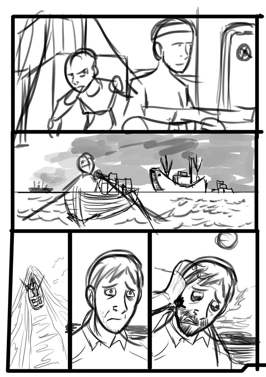
In figure 1, there is a montage of the Goon and Isabella spending time together while Frankie, the Goons best friend has to defend the streets himself. The first panel shows the silhouette of the goon and Isabella on a Chinese themed balcony with Chinese styled buildings in the back. There is a romantic atmosphere with the silhouettes of blossom flowing across the panel. There is also an arch which helps frame the moment. Although the background is not so detailed the silhouettes are strong and you understand that they are in love.


Figure 1. Goon Pages 50, 51 and 52 (Powell 2011)

The use of symbols represented here are some props such as the candle and wineglass. These are used to help suggest that this is a romantic dinner between the two lovers. In panel 2 on page 51, Frankie is hiding behind a crate as two gangster approach wielding guns, unaware of Frankie's location. Although they are equally spaced out, Frankie’s outnumbered by the two gangsters. Here I can see while the panel is balanced, if the goon was there this would be an even fight. However without him in the picture we can see how much Frankie needs the Goons assistance. In page 52, we see Isabella and the Goon smiling which is something he does not do very often. Meanwhile three of the panels consist of Frankie trying to fight Goon’s enemies by himself. We see the self determination on his face as he drives and shoots at the same time. We get the impression of this through the context of him trying to hold onto the territory that he and the Goon own. In panels 2 and 3 we get a moment transition (McCloud 1994) as Frankie gets punched by some gangster. This is suggested through the visual establishment of the gangsters shown in the previous page. The panels in this montage share no borders but some have a faded out white borders that makes the sequence more nostalgic and fragmented though memories. This is appropriate because these visual occur during a flashback. Furthermore the montage of the Goon having romantic moments with Isabella works really well in contrast to Frankie's moments of action. These moments show how much that the Goon is needed and that Frankie needs his friend to watch his back like they used to.

Panels

Although the use of words can help emphasise moments, some cases such as the Goon, do not work.
The way the panels are arranged in this sequence are effective. In the comic it starts off like a normal comic would have where the panels are juxtaposition to each other. After Isabella leaves, the panels get bigger until the scene where the Goon breaks down. The reader sees the Goons reflection in his perspective. Some of the flashback comic panels have no borders similar to the panels that occur in the present (Dawe 2014).

Colours
The colours used in this comic's flashback sequences are very minimal, washed out and sepia toned. (PublishersWeekly.com 2007)

Figure 2. Goon page 79 (Powell 2011)


 Figure 3. Goon page 80 (Powell 2011)

Goon’s posture is now in a lower position to show that he has no control of what is happening here.

Lighting

Figure 4. Goon page 81 (Powell 2011)

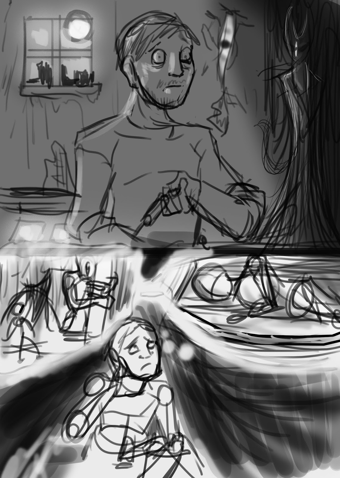
The composition in the above comic page is effective as there is a strong contrast with the light. The way shadows cast over half of the Goons face is reminiscent to the lighting effects in the noir genre but it also suggests that the character is undergoing emotional stress. Here the Goon appears stable after Isabelle leaves, assuming that he has handled it well. His body language appears stable as he has both hands on the armrests of the chair and is sitting upright. In the second panel the door's framework acts as a frame surrounding the main focus. The negative space in panel 2 allows for a strong contrast and for Goon to act as a focal point on the panel.

Figure 5. Goon page 82 (Powell 2011)

The next page takes place in his bathroom. There are a few props to suggest this. The transition is momentarily and shifts close to Goon which then leads onto the next page.

Body language

The following five panels are portraits of the goon's face which fill the page. The first panel shows the goon just staring at the mirror which in turn we see the reflection. The white border helps the Goons silhouette stand out and the grayscale shading helps contrasts well with the browning sepia toned background. 
Furthermore the emphasis of the facial expression is not only a breakdown of himself, he also realises that he is unable to move on. Although Isabella's reasoning for leaving him is vague but to him he's convinced that no woman would ever fall in love with him again (Dawe 2014).


Figure 6. Goon page 83 (Powell 2011)


Figure 7. Goon page 84 (Powell 2011)

Here he begins to show sadness as his eyes begin to become watery. His hand covers his mouth and he’s trying to hide his expression and true thoughts of what’s happened. The wrinkle on his head begin to appear more clearly. It looks like he's trying his best to keep himself under control but he's showing weakness.

Figure 8. Goon Page 85 (Powell 2011)

This panel continues his gradual breakdown. This time his left hand reinforces the right hand as he tries to keep himself emotionally under control.


Figure 9. Goon Page 86 (Powell 2010)

His two hands now rest on his temple the fingers close together showing that there is some attempts to keep himself under control. His eyes have grown smaller and his tears are now halfway down his face.


Figure 10. Goon Page 87 (Powell 2010)

In this page of this sequence, the Goons body language and gestures illustrate his frustration and the peak of his breakdown. The hands are outstretched and clutching his face desperately causing several wrinkles in his skin. Tears are now dripping down his face in multiple streams. The eyes have gotten smaller and this emphasize the expression. Dark rings are present around Goon's eyes this helps focus on his eyes. The exaggerated facial expression adds to the thought that are flowing through his head at this moment, his mouth is wider and nearly open and you can nearly see his individual teeth. Closure allows us to perceive as if it were an animated sequence.

Background

The background has lost its colour and has darkened to emphasis that he has descended into darkness where he believes there is no return. His hair is now quite mess and unkept. The best thing about this scene is that words are not necessary for this sequence. What is more important is that it was statement that the goon will never be happy. Overall, you feel very sympathetic for the Goon in this sequence and this makes it a tragic moment in the comic's series. The background lacks in detail but it allows for the reader to focus on Goon's face. The sequence takes place in the bathroom and as these rooms are a place of privacy and secrecy this is an appropriate place for him to express how he is feeling visually.

In Conclusion, The flashback visual style is appealing and the transition of bordered to border less panels in figure 1, helped reflect this. The visual language of the expression and hand gestures helped convey Goons's emotional breakdown. The panel layouts helped make the scene stand out.

Reference

Dawe, I. 2014. Comic Con Discoveries Part 1: The Goon and The Guns of Shadow Valley. [online] Sequart Organization. Available at: http://sequart.org/magazine/48739/comic-con-discoveries-part-1-the-goon-and-the-guns-of-shadow-valley/ [Accessed 17 Jan. 2016].

Dooley, C. 2007. Eric Powell’s Legacy Continues With ‘The Goon: Chinatown’. [online] Comics Alliance. Available at: http://comicsalliance.com/eric-powell-s-legacy-continues-with-the-goon-chinatown/ [Accessed 17 Jan. 2016].

Mahmoud, M. and Robinson, P. 2011. Interpreting hand-over-face gestures. 1st ed. [ebook] Cambridge: University of Cambridge. Available at: http://www.cl.cam.ac.uk/~mmam3/pub/ACII2011-Doctoral-2011.pdf [Accessed 29 Mar. 2016].

Mateu-Mestre, M. 2010. Framed Ink: Drawing and composition for visual storytellers. Culver City: Design Studio Press.

McCloud, S. (1994). Understanding comics. New York: HarperPerennial.Sims, C. 2011. The 13 Greatest Hits (and Stabbings, and Gunshots...) of THE GOON. [online] Comics Alliance. Available at: http://comicsalliance.com/the-goon-comic-best/ [Accessed 14 Feb. 2016].

Powell, E. and Stewart, D. 2010. The Goon in Chinatown and the mystery of Mr. Wicker. Milwaukie, Or.: Dark Horse Books.

PublishersWeekly.com, 2007. Fiction Book Review: The Goon: Chinatown and the Mystery of Mr. Wicker by Eric Powell, Author, Eric Powell, Illustrator . Dark Horse $19.95 (128p) ISBN 978-1-59307-833-1. [online] Available at: http://www.publishersweekly.com/978-1-59307-833-1 [Accessed 17 Jan. 2016].

Tuesday 17 November 2015

Week 11 - Meeting with Simone and Alex Graham

My meeting with Simone has been cancelled due to her unavailability. However I have managed to send her my essay and I will hopefully receive feedback from her on Tuesday evening.

On the friday, Alex Graham came into Abertay to discuss what it is like to create realistic 3D work. Based on what she showed us, she specialized in 3D environments for AAA games. She gave us interesting feedback and I got the opportunity  to ask her to review my portfolio. She liked my 2D work of the antagonist character I made for a third year module. She suggested that I could provide further evidence on its function and purpose. However she did like my development process for the character. Here I took the 2D work I made in semester 1 and used it as reference material when making the 3D version of the character. Alex suggested that I could try the high poly to low poly approach.
In her talk, She discussed how she tackled the visual test that the Chinese room had given her as part of her interview process. She began researching what looked like authentic props from a certain era based on the brief, she also considered how it was used and what type of person used it in a way to suggest storytelling.

While most of her advice was aimed at those students who focused on 3D, it was interesting to see the tips she had given such as using bevel effects to remove the jagged edges on models you see in AAA games.

The following are links to research material related to visual storytelling.
I managed  to speak to Simone the next day on the Wednesday afternoon talk about the comments she gave me. Her guidance was helpful.

Research Notes

Here are some notes I took about a series of essays about H.P.Lovecraft.

Donald r. Burleson ,on Lovecraft's theme touching the glass

http://www.graphics.com/article-old/writing-visual-thinkers-narrative-structures

https://books.google.co.uk/books?id=e-aWWTZeergC&pg=PA61&lpg=PA61&dq=comics+simplify+complex+stories&source=bl&ots=agWevNnkr9&sig=irh3b-80dGQIJtW3Iuo4e2WnUJQ&hl=en&sa=X&ved=0CEAQ6AEwBWoVChMImp31mfWcyQIVBEYPCh2JQQN-#v=onepage&q=comics%20simplify%20complex%20stories&f=false

http://www.slideshare.net/DanielaMolnar/narrative-image-the-how-and-why-of-visual-storytelling

http://digitalcommons.unl.edu/cgi/viewcontent.cgi?article=1009&context=sane

He wrote a large variety of stories for magazines through his lifetime, some of which include The Call of Cthulhu (1928), The Shadow Out of Time (1936), The Dunwich Horror (1929) and Dagon (1917). However this sub-genre shares similar themes related to cosmic horror. 
The term Lovecraftian Horror was used “as a catch-all for those tales of Cosmic Horror that parallel the Cthulhu Mythos(Rawlik, 2013) since they shared similarities. 
Some films and games have also been inspired by the works of Lovecraft. Call of Cthulu: Dark Corners of the Earth (2005) and Dagon (2001) both retold the story “The Shadow Over Innsmouth” (1936) despite bearing different titles.
For example, Ian Edington’s comic adaptation of H.G Well’s War of the Worlds (2006) showed a visual depiction of how the Martians, the fighting machine and the setting were represented while following the novel’s story.

“Wordless picture books allow readers to construct diverse interpretations.” This can be positive the reader , but it can also distance them from the original intention of the work.

http://www.readingrockets.org/article/exploring-wordless-picture-books

Although they can be very descriptive, comics may have difficulty communicating the narrative especially translated are in another language that one may not understand. Therefore it should be just as important for a comic to understand how to tell a story with or without dialogue, especially if the reader’s native language is not represented in the narrative, understanding is hindered.

Monday 16 November 2015

Semester 1: Front Cover and Main Comic Thumbnails


Dagon Adaptation Front Cover Mood Board

To begin with, made some quick front cover iterations to explore what elements that the front cover should include. Some iterations were minimum whereas others were just aspects of locations.


Dagon Front Cover Ideas

I really liked this thumbnail I made of Father Dagon under the waves of the ocean while a ship passes over it and using the idea of depth and scale contrast to highlight an eerie effect to suggest that something of this size lurks within the depths of the sea. After all the seafloor still remains unexplored. I was inspired by his piece to develop this idea for the Dagon story. 


This is a photograph that I took on my train trip from Dundee one night. I found its composition and lighting to be inspirational for the front cover as a thumbnail idea. My plan for the next semester is that I will be using these thumbnails as a starting point. I will also make amendments and iterations based on them for the final comic pages. Once I have achieved this stage, I will consider to add additional detail unless I become restricted by time constraints. At one point, he photo itself was considered as the front cover.
Progress 

As my project is focusing on how visuals can tell a story. I decided to begin production on s. I used the original source materials as the "Screenplay" for the story as it helped build enough ground for me to begin  developing ideas. I also considered how some of the environments was described in the book. These designs that are shown in the following thumbnails will not the final designs. Furthermore, I have not fully developed the main character and the monolith.

Comic Thumbnails


Page 1


Page 2 Version 1

Page 2 Version 2


Page 3


Page 4


Page 5


Page 6


Page 7


Page 8


Page 9


Page 10


Page 11


Page 12


Page 13


Page 14


Page 15


Page 16


Page 17

Page 18


Page 19

As a means of improving clarity of the thumbnails, these will be reiterated based on feedback from my peers.
Reference

Front cover Mood board Accessed on the 5th of November

http://static.comicvine.com/uploads/scale_small/0/787/478350-132511_20080605061330_large.jpg
http://i.kinja-img.com/gawker-media/image/upload/s--Cp_1oujN--/18m5hnv1c94zjjpg.jpg
https://beastrabban.files.wordpress.com/2014/01/tintin-dunwich-horror.jpg
http://i2.cdnds.net/11/46/618_comics_infestation_2.jpg
https://ksr-ugc.imgix.net/projects/32369/photo-original.jpg?v=1397762907&w=1536&h=1152&fit=crop&auto=format&q=92&s=fe543d482c504665d8dfca2ae159b7a8
http://2.bp.blogspot.com/-WA-NQoDnN2I/UhvDS5DuNcI/AAAAAAAAXpI/4mAToGn97MQ/s1600/affiche.jpg
http://images.bigcartel.com/bigcartel/product_images/156294316/max_h-300+max_w-300/dagon.jpg
https://d2a2wjuuf1c30f.cloudfront.net/product_photos/14151070/1COVER_DAGON_original.jpg
http://vignette3.wikia.nocookie.net/lovecraft/images/c/ca/Dagon_Cover.PNG/revision/latest/scale-to-width-down/330?cb=20111127235415
http://orig15.deviantart.net/a6f9/f/2013/033/6/0/hpl_s_dagon__for_beginning_readers____cover_by_drfaustusau-d5tkk2h.png

Skochev, N. 2008. Cthulhu. [image] Available at: http://shadow-net.deviantart.com/art/Cthulhu-93988981 [Accessed 16 Nov. 2015].