Showing posts with label Front cover. Show all posts

Monday, 14 March 2016

Inside Cover Development

In several comics I've looked at ,they include an additional page with credits at the beginning. So I chose to apply a similar approach with my comic. I wanted to continue with the use of teh textured visual style,which has been applied for the flash back sequences.


This is one of the earliest attempts of this was the image below.


Attempt 1


Attempt 2

I liked the strong silhouettes in the second attempt. However It appears to be too flat. After looking at This 2.5 dimensional panning from this showcase.


Dark Forest Assets video


Current Attempt

This latest attempt shows a greater improvement in the depth through the use of atmospheric perspective. Its needing a few more tweeks but it it still looks better than before. I managed to put together a double page spread to use for the inside pages for the comic.


Double Page Spread

Wednesday, 9 March 2016

Week Progress 9

With Dunfermline Comic Con taken place on Saturday, I managed to take some time to rest on the Sunday.
On the Monday, I worked on revisiting my front and back cover. I was not happy with the visuals for the framework. So I applied highlights to it and cleaned up the line work to make it less cluttered. I also added a few additional shadows to allow extra depth to the frame. 


Before Revision


After Revision

Some of the changes made to this were the depth of the frame to help add some three dimensional space to the illustration. However for the elements such as the tentacles, I'll need to add some extra shading to help give them a sense of depth. The other changes I've made was reduced the size of the boat to help make the protagonist look more vulnerable. I also adjusted the placement of the horizon to improve the illustration's overall composition.


Here is the design of how I planned to design the back cover. However I decided to adjust the size of the portrait and make it smaller. 

Page 11 Revisited

I looked at the sketch of the protagonist making his descent down  the cliff edge. However I decided that the way it looked did not appear effective as I intended. I applied the idle of using hidden lines found in the shapes of the environment to help the reader's eye flow through the comic.

Before


I was not very happy with how the page turned out. the first panel was meant to show the viewer the height of the chasm from the protagonist's perceptive. The next panel was to show his descent. However I liked the idea of presenting a panel where he looks over his shoulder at something and we are left on a cliff hanger until the next page. The way that he protagonist climbs down the cliff face did not look right. Therefore I decided that this scene would be require a reiteration.

After


Sketch


 Fleshed out Page


Rendered page with visual style applied.

I included a hint of the glow in the second panel which builds up to the final panel. I also like the height of the panel as it can suggest the duration and height of the descent. My main concern for this is  how dark will it look on printed paper. It may be that I will need to go through additional adjustments of the lighting in order to make it visually clear when printed.

Thursday, 28 January 2016

Book Design: Framing

I went to the McManus Gallery in Dundee to look for paintings that were made around the time period of the 1910s. Brian said my frames looked more Georgian and did not reflect the painting frame style of the 1910s. He suggested that I take a visit to the local art museum.


 Photos of painting frames from the 1910s

These are a series of photos I took of the framework of paintings from the 1910s. The frames were wooden and included straight geometry with curved decors between them. Some of the frames were different colours. With this reinforced research, I can still apply my Lovecraftian frame decor and still allow me to make it look like it was a painting from that time period.

Saturday, 16 January 2016

Week 1 Weekend - Book Design

During this weekend, I took some time to work on the front and back cover for the comic. If I go ahead and get a printed form of the comic then I could allow people to read it in a traditional way. However If I am unable to do so then I aim to have a digital form available so they they can read it.

Early Thumbnails


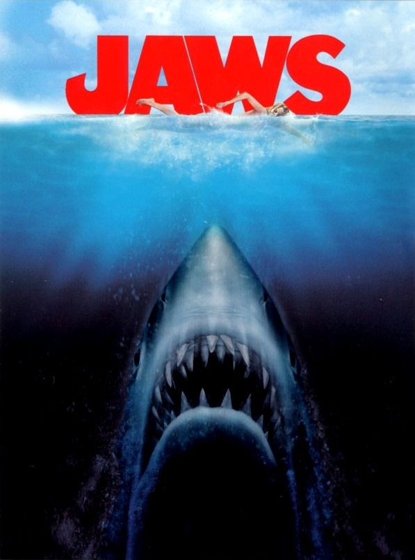
While I do like the way this is laid out with the ocean at the top with the eye underneath. The way the eye looks inappropriate.The inspiration for this thumbnail was from an old VHS cover of a b-movie called "Evil Beneath Loch Ness". 


 Front Cover Iterations


Rough Silhouette of the Front Cover

Eventually, I decided to go from this illustrated version where there is a large silhouette of a humanoid hand reaching up to the underbelly of a rowing boat. For this illustration I wanted to make sure that the boat and the large hand were the key focuses. I took some inspiration for this thumbnail from a few sources.


Depth and sea monster Influence

I also considered using a Lovecraftian styled frame for the illustration the front cover cover. However I spoke to Brian about this and he told em the way i had designed the frame appeared  more older than if it were made in 1914. He suggested that i took a look at some painting in the local museum that were amide in 1914 and observe their framing. Never the least I designed the frame like this to reflect the themes the recurring themes of Lovecraft such as tentacles,eyes, fins and other familiar traits used unfamiliar ways. Furthermore another theme that occurs is that Lovecraft's often present to people a indefinite form.In other words, no one whats the creature's true form looks like or that it keeps changing its form. I also included some marine traits like barnacles and fins and scales.


Lovecraftian Frame Sketch


 Lovecraftian Frame Line Artwork


Hand Iterations


Hand Iterations

 Here are some further iterations into how teh and could look. I found it quite challenging because I wanted to make sure the hand looks human like but had extensive features that are not often associated with humans such as the use of webbed hands and elongated fingers. I also wanted to include the use of pointy finger tips to emphasis the long fingers and add a bit of creepiness.


Front Cover Iterations

Here I elongated the hand to fit he Original final design of the creature plus it helps fit the eerie and mucky atmosphere for the water.


Back cover Design Development

For the back cover, I want to it to feature an illustration which reflected an opposite mood.However I wanted there to be a connect  between the two covers through the use of environment and colour. I revisited one of the thumbnail I made earlier and I development on it further.

 Rowing Boat Sketch


Rowing Boat Coloured


Boat Reduced

The small size of the man in the rowing boat does help provide a sense of scale and shows how small he is in this large and wide ocean. I decided to include some grey and blacks clouds  as a form of o foreshadowing the nightmares that the main character will encounter. Furthermore the use of colour and more positive lighting is a suitable contrasts compare to the front cover.


Frontcover  Illustration on top of Book Texture

https://www.flickr.com/photos/potatojunkie/4530265001/in/photostream/

However I plan to find old books that I possess which may be appropriate for displaying old styled book.


Photos of Book Textures

With these book textures applied to the front cover illustration, it will help give the comic a sense of age.