Showing posts with label Practice. Show all posts

Monday, 21 March 2016

Revisited Model Sheets: Father Dagon

I made some changes to my original Dagon designs so I had to modify the model to reflect these changes.


Before 


After

To provide a reference to the uncanny valley, I decided to add the two eyes at both sides with the addition of a gill at the front in the shape of a mouth. This would help with the idea of symmetry but it also shows the deception of this creature. It could be argued that people who saw this creature mistook it's front gill as a mouth . The funnels on its shoulders can be used as a defense mechanism where it can blind its prey, or pride additional means to gain acceleration when swimming. However I think I will need to modify the front view's head a bi to make it look like it is looking straight. The front profile of Father Dagon did not look straight on so I decided to fix that.


Revised Model sheet

Wednesday, 16 March 2016

Week 10 Progress and Meeting

I spent this week modifying comic pages based on my feedback. This week, I have been thinking about how I can add additional panels to help clearly explain how the protagonist climbs down the hummock and returns to his boat. In existing adaptations, this scene has been represented of him waking away from the hummock whereas others such as her adaptation has a starry background with the protagonist's silhouettes to suggest that he running across the empty plane. That was my original attempt but with the inclusion of storm clouds to build up to the point where it begins to rain. The significance of this in the story is to help cover up the location of the mysterious location. That would explain why the captain knew nothing out his black mire as it was flooded by the time that the got there. However it does feel a bit strange how rain could flood volcanic upheaval. On the other hand, it could be that the land began to sink underneath the ocean just as the storm erupts around the protagonists. I revised my older pages to make sure that the characters had a consistence colour scheme.

What I have so far for the page where the hero returns to the boat is the following:

Panel 1: the protagonist is making his decent down the the hummock and he makes one last glance at the drop , just to be sure that he is not being followed by the creature.
Panel 2: He is running along a familiar landmark from page 8,which in this case is the giant skeleton of a long dead sea creature.
Panel 3: he runs along a flat plane running underneath the moon slowly being engulfed by stormy clouds.
Panel 4: He pushes the boat onto its underbelly and packs all the essentials into it.
Panel 5: The shelters underneath the boat cover as the environment around him begins to flood.
Panel 6: It is a clear night sky the boat is out at sea and is spotted by a boat with a spotlight.

Rough Thumbnail of Page

I also took the opportunity to work on my dissertation. So this Saturday I spent my time working on it. I took Brian's suggestion on how to improve my introduction. So I included a paragraph discussing the problems and issue of my project and what I will need to include in order to to convey a story visually. With his help, I managed to reduce the amount of words for my introduction.

Sunday, 28 February 2016

Batman:The New 52 Analysis

In the first volume where Batman encounters the Court of Owls, there is a technique which I noticed while reading. There is a series of pages where the panels are altered 90 degrees per page until they return to their original state. I found this to be quite effective as Fey (2012) says that this was the author and writer's way to illustrate Batman's sense of disorientation as well as reflect his distorted mind as he travels through their lair.
I would like to apply this at an important scene in the story where the protagonist encounters Father Dagon and it's monolith. My idea is to begin with the scene were the protagonist encounters the monolith which will be orientated in the correct position at 0 degrees.The next page will be at a landscape orientation at 90 degrees. The page with the appearance of Father Dagon will be positioned upside down at 180 degrees and then the next page after that,will be another landscape picture, This time it will be at 270 degrees.
Finally the scene where the monster spots the hero and as he runs away, the orientation will come full circle as a way to reflect the hero's disorientated mind and to further enhance the line for the story;

"I think I went mad then." (Lovecraft,1919, pp.23-29)

Here is a test of what to expect.


First Page


Second Page


Third Page


Fourth Page
References
Fey, E. 2012. Batman: Court of Owls (New 52) Volume 1 (2/2). [Blog] Era Fey Gossips. Available at: http://erafeygossips.blogspot.co.uk/2012/11/batman-court-of-owls-new-52-volume-1-22.html [Accessed 27 Jan. 2016].

Lovecraft, H.P. 1919. Dagon. The Vagrant. (11): pp.23–29.

Monday, 1 February 2016

Global Game Jam

I attended the Global Game Jam this year. I took part in a team where some of the members were part of the Mprof course. I managed to get on really well with them. My main role on the project was the animator and one of the artists.

What did I get out of this event?
  • I worked alongside another artist.
  • I followed tasks in an appropriate order.
  • Learned more about how to use Illustrator and PS to make sprite sheets.
  • Some practice making some explosion animations.
  • I found out that I needed to work on drawing characters from a top view perspective. 
  • Reconsider making simpler and smoother walking animations
My approach was different but I feel that I could have benefited by creating the assets in Flash or Illustrator rather than in Photoshop. Here are some of the illustrations and characters I worked on for the project. I am quite happy with how our game turned out. In fact we continued to develop the game after the game jam. We decided on a quick team name and went for Digital Cupcakes. That night when I returned home, I decided to make a quick pixel-esque logo. I had the image of the neon glow with some faint fog to apply as an effect.


Logo Iterations

I showed the two iteration to the team and they preferred the icing style cupcake for the logo.

Pre-production Work


 Title Screen


Title screen at 1280 by 720, our chosen screen resolution


Improved Title Screen

Character Assets

Player 1 Character Profile

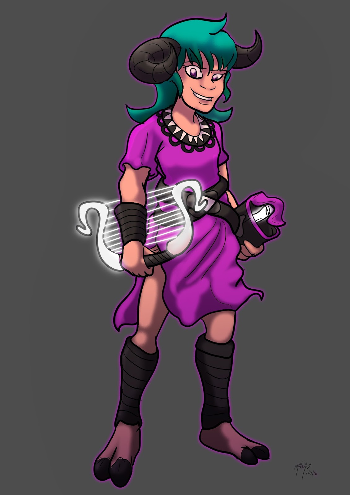
The main style for the charters were inspired by D.J Ross's arts style form the LORE Series.

Player 1 Casting Animation

Player 1 Throwing Animation

Player 1 Walking Animation


Player 1 Spirit Form

Player 1 Frozen

Player 2 Animations

Player 2 Character Profile


Player 2 Casting Animations

Player 2 Throwing Animations

Player 2 Spirit Form


Player 2 Frozen

Explosion Sprite Sheet

To fit the fantasy and  magical element of our game we decided to change the explosion colour to a green/blue. 
In summary, I am quite happy with how the project turned out. I have been helping out my team when necessary to help add further polish to the final game.

Thursday, 14 January 2016

Practice: Mascot Contest for Dee-con 2016

I took the opportunity to enter the Dee-con 2016 Character mascot Contest as a way to practice designing characters.

Early Thumbnails and sketches


The concept decided to develop and I drew that character as a mature figure. 


In hindsight, I feel that the deign was out of place. In the end, the final design chosen was a mermaid that can swim in space. Although I went for the idea of mythological creatures, I feel like I could have thought more outside the box. A friend of mine suggested  that I should have done a robot design. at an early stage I did consider that.

Friday, 8 January 2016

Christmas Holiday Drawing Practice

I used the holidays as an opportunity for me to draw some artwork. After I saw the new star wars film. I began to develop some artwork of the Antagonist Kyla Ren. I liked the character for his appearance. Although he looked very much like Darth Vader in the previous movies, I did like how his design looked quite simple. I can understand why the film makers wanted him to be a very complex charter however form a different perspective he is basically a emotional stereotype based on his emotional and tempered performance in the film. The only difference is that when  he takes off the helmet it feels like a completely different character. While it is a nice change, it feels somewhat out of place. Furthermore in this iteration of the character he looked  like Jon snow from the HBO TV show Game of Thrones if he was a dark Jedi.I began this practice with a speed paint of the charter. It was an attempt to work on my skills in figure drawing. I drew Kylo in a superior pose with his saber out ,looking down at the viewer with head tilted upward and smiling quite menacingly.


First Attempt


Refined Line Art


Coloured Art


Flipped Character with Background


Flipped Final Version


Satirical Illustration

While I was in the mood and influence of the film I drew some doodles as a way to satirise the character. In the film, he was portrayed as a powerful individual but with a weak and unstable mind. I drew the character in a comic style playing the Mobile app, Flappy bird which has a reputation to be a frustrating but simple game. I tried to establish a scenario where the character would. I was inspired by some comics I found on Tumblr which satirized the characters's behaviour and personality. What amazes me is how quickly these out just after the film's release.


So I decided to include some exaggerated expression for the characters. The main reason I thought I would include these on this blog is because these brief exercises allowed me to warm up my skills in drawing figures and expressions for the start of this semester.