Showing posts with label Preproduction. Show all posts

Friday, 1 April 2016

Sound Effects in Comics

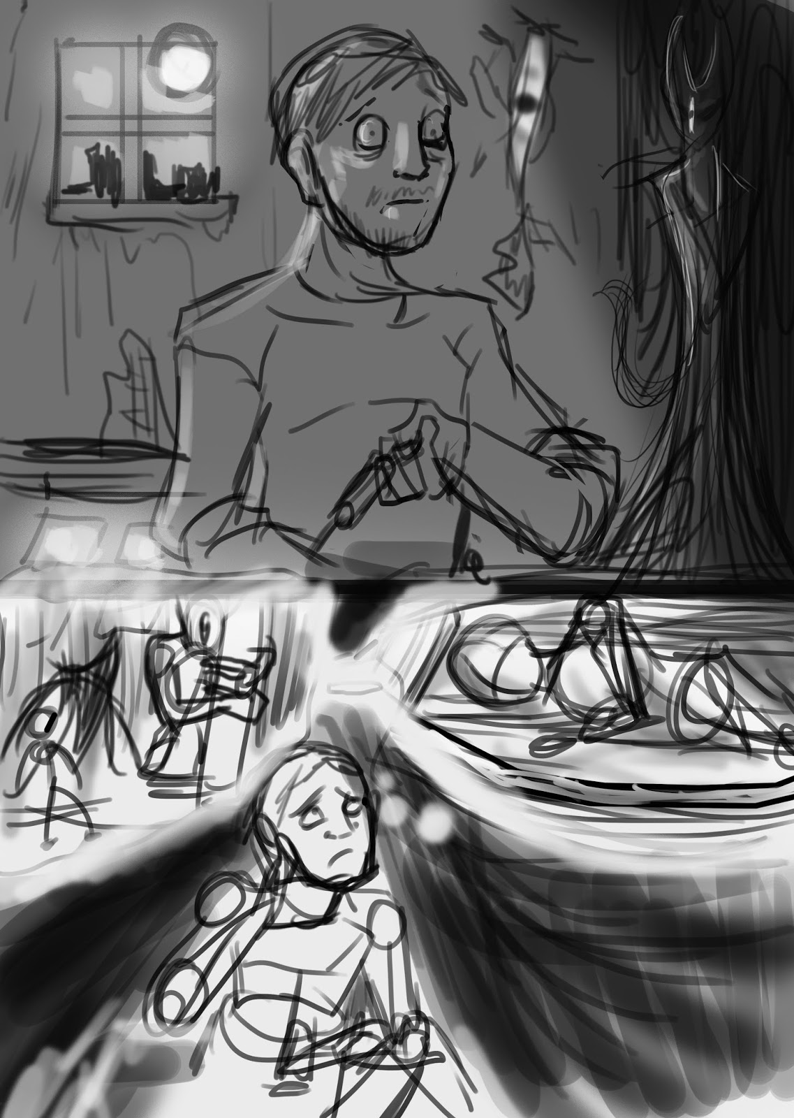
I have had some thoughts about including sound in the comic, especially in the scene where the monster merges. Some of my thoughts were to apply the text in a form where it looks it it is part of the environment in a similar to this panel from the Flash and of Will Esiner's work.


The Flash #1 features a title where the inside of the text features panels of the Flash fighting.The layout of the panels are placed in a circular composition all looking like slices. The gutters all direct towards the Flash in the centre which helps with the overall composition. The colours of the panels behind the Flash are coloured blue which helps make it look further way whereas the panels in the form of the Flash feature warm colours benefiting the depth and perspective of the picture.


I also discovered a blog by Zainab Akhtar that discusses the ways that sound effects are implemented into the comic illustration. He talks about an artist called Frankie Quietly who has deployed sound effects in the illustrations. Akhtar (2015) states that integrated SFX in comics often harmonies with its environment and its context whereas traditional SFX that stands out has more visual impact when elements such as shapes, colour and composition are considered. He also discusses about James Stokoe ,the artist who illustrated Godzilla:The Half-Century War (2013). Within the comic there, minimum sound effects. In one page where Godzilla roars, the sound effect is represented by a distorted, sharp and large illustration with a warm colour scheme. The mixture of these elements help provide an insight of how it would be heard if audible. It also connects with the idea of how the original Gozilla roar was produced through the use of a violin and a rubber glove (Rolfe 2008).

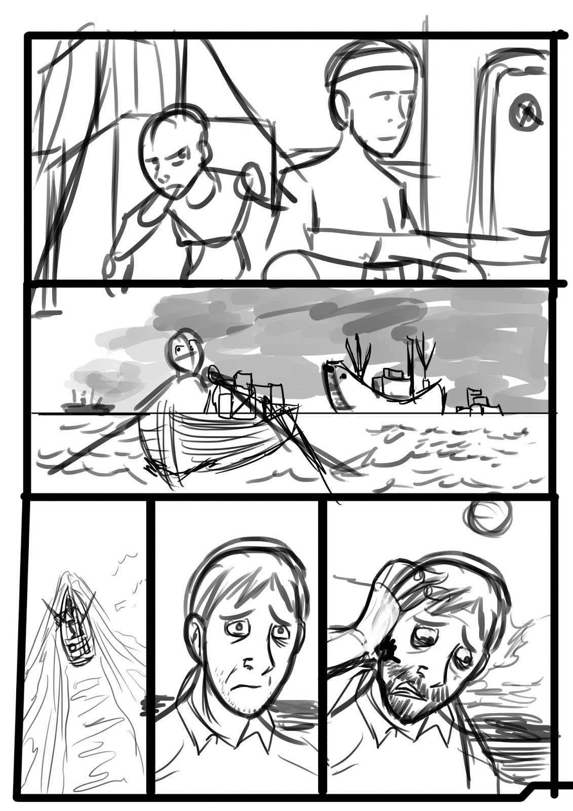
Here is a test I did where I took page 14 and applied sound effects to it.


Page 14

The text produced a curved which helps lead onto the protagonist and it also adds to the impact the splashing water. The chosen text font was "Super Weird". I think it would look better if the text was white like the foam of the waves, making it appear more integrated in the image. 

References
  • Rolfe, J. 2008. Godzillathon #1 Godzilla (1954). [video] Available at: https://www.youtube.com/watch?v=Avc4AS3AvcA [Accessed 1 Apr. 2016].
  • Stokoe, J. 2013. Godzilla:The Half- Century War. San Diego, Calif.: IDW.
  • Akhtar, Z. 2015. Snapshot thoughts on comics sfx: Quitely does it. [Blog] Comics and Cola. Available at: http://www.comicsandcola.com/2015/06/snapshot-thoughts-on-comics-sfx-quitely.html [Accessed 1 Apr. 2016].
  • Manapul, F. 2011 Flash #1. [image] Available at: http://comicsalliance.com/files/2011/09/flash01.jpg [Accessed 1 Apr. 2016].
  • Manapul, F. 2011. Flash #1. [image] Available at: http://comicsalliance.com/files/2011/09/flash04.jpg [Accessed 1 Apr. 2016].

Monday, 21 March 2016

Revisited Model Sheets: Father Dagon

I made some changes to my original Dagon designs so I had to modify the model to reflect these changes.


Before 


After

To provide a reference to the uncanny valley, I decided to add the two eyes at both sides with the addition of a gill at the front in the shape of a mouth. This would help with the idea of symmetry but it also shows the deception of this creature. It could be argued that people who saw this creature mistook it's front gill as a mouth . The funnels on its shoulders can be used as a defense mechanism where it can blind its prey, or pride additional means to gain acceleration when swimming. However I think I will need to modify the front view's head a bi to make it look like it is looking straight. The front profile of Father Dagon did not look straight on so I decided to fix that.


Revised Model sheet

Thursday, 17 March 2016

Comic Page Production Process

Each comic artist follows their own ways to make comics. While some go for the digital approach, some still use the traditional means when producing comic pages. It can also depend on the chosen style of what materials will be used. Here is my pipeline I have chosen to follow.

Stage 1: Sketches and Thumbnails

I usually begin with sketching out a brief layout of the comic page. Sometimes it is good to work on the smallest scale so that you can determine if it is can be read visually from a distance. Once a preliminary sketch has been made. I would revisit it later to apply further detail to it.
For the environments, I used screenshots of low poly 3D models created in Maya to suggest a three dimensional space. However I drew over these to make it look as if it it were drawn traditionally.

Stage 2: Lined Artwork

Here I  go over the refined sketches in cleaner lines. During this stage, I import the lined work over to Adobe Illustrator and basically, further refining it by "live tracing" the illustration. This approach makes the lines appear more smooth with cleaner edges.

Stage 3: Flat Colouring

Once the lines have been established, I would then apply colour to the illustration. I start off with flat colours to act as a base and then add extra layers to colour certain parts of the figure.To reduce the file size of my PSD files I would often merge these coloured layers into one. When it come to colouring characters, I usually give each one their own base layer so that I can colour the characters and backgrounds separately.

Stage 4: Lighting and Additional effects

Here I added an opaque layer and have it overlaying the main flat colour layer. Here I erased spots on the layer to suggest where the light is hitting.

Stage 5: Visual Style

Here I could include a  series of additional effects such as opaque layers of white colour to suggest atmospheric perspective. I decided to apply unique visual styles to the comic to suggest the past, present and future as shown below.


Past Flashback

I used a paper texture to suggest that these panels are being told in the protagonist's written account. In additional, I applied the panel borders with a cloudy bright brush to suggest that these panels are fragments of the protagonist's memories. 


Present
In this one, I have used cool and warm colours to establish a clear but atmospheric environment


Vision of the Future

I used hellish colours such as a red overlay to suggest what horrific events could happen in the future.

Problems


Pixelated Line Work


I have encountered a few issues when importing line work. Sometimes I would need to resize the line work to fit into the page .This can result in pixelated line work. Fortunately, this can be fixed by going over those points or by bringing the lines back into Adobe Illustrator and then reimporting it into Adobe Photoshop but keep it in its imported state without rasterizing the layer. This can lead to an iterative process.

Thursday, 3 December 2015

Final Week Status: Visual Development

I have been unable to continue with additional work for the project. Just a few days before the day I submitted my coursework I caught a sore throat along with some restless nights. Therefore, I was not able to make enough process as I had hoped. I had a meeting with my supervisor, Brian and he showed a positive response to my research proposal so it looks like I've done it well.

The first thing that Lynn spoke to me about was the way the head of Dagon design appeared.The design was for a creature which had its jaw and teeth on the top of its head. In a different perspective it looked like a fish's head looking up. She was telling me that there was not definite way to determine which was ways the correct direction of the creature. I did not understand fully what she meant by this she referred the duck and rabbit illusion where there was not definite way for the object to appear.

She gave me the idea of using the holidays to practice my art style and use a thinner brush while I created my drawings. While I was not sure about this, I did try some tests and found out that it actually helped me. Her advice allowed me to figure out how I could overcome this challenge. Nevertheless the idea of having no definite appearance for the way a creature appearance acne could fit the them that Lovecraft has featured in his works. I could keep the idea but include some additional feature to give a more clearer definition of the ambiguous illustration my design gives off.

While I have chosen several inspirations for the rat style I should undergo some tests  and determine what would be the mos appropriate visual style. This led to a mixture of approaches.


Lovecraft related Sketches

I attempted to apply a surreal and exaggerated visual style.

Shading Iterations


Character Figure Tests


Visual Style Experimentation

Thursday, 26 November 2015

German Sea Raider Research and Development

To add a level of authenticity, I decided to look at a few sources to get an idea of the type of uniforms worn by German naval officers and sea men.

http://www.militaryfactory.com/smallarms/by-country.asp?Country=Germany

http://www.militaryfactory.com/imageviewer/sa/pic-detail.asp?smallarms_id=455&sCurrentPic=pic1

http://www.ww1medals.net/WW1%20IMPERIAL%20GERMAN%20NAVAL%20BADGES%202.html

http://german-navy.tripod.com/sms_paint-overview.htm

I was wanting the German soldiers to be wielding weapons that they would be using during that time period. Based on some images of German colonial uniforms, they were a contrast to the American navy blue uniform. Therefore I thought it would be ideal to use the light uniform which with the dark blue uniforms of the protagonist's affiliated faction.
The big problem in the short story is that the character has no name, no nationality, no definite character description. However, since this was H.P. Lovecraft's earliest work, it could be argued that it was aimed at the inhabitants of America.  Fortunately these details can actually help make him more identifiable to allow readers to project themselves onto him.


German Sea Raiders Mood Board

Here are a series of drawings I made to visualize the German raiders and their equipment.


German Sea Raiders Iterations


German Ship Iterations


German Weapons

The following images are screenshots of a boat I created in Maya.These will be used a s reference material when drawing teh boat in a particular perspective.


Monday, 16 November 2015

Semester 1: Front Cover and Main Comic Thumbnails


Dagon Adaptation Front Cover Mood Board

To begin with, made some quick front cover iterations to explore what elements that the front cover should include. Some iterations were minimum whereas others were just aspects of locations.


Dagon Front Cover Ideas

I really liked this thumbnail I made of Father Dagon under the waves of the ocean while a ship passes over it and using the idea of depth and scale contrast to highlight an eerie effect to suggest that something of this size lurks within the depths of the sea. After all the seafloor still remains unexplored. I was inspired by his piece to develop this idea for the Dagon story. 


This is a photograph that I took on my train trip from Dundee one night. I found its composition and lighting to be inspirational for the front cover as a thumbnail idea. My plan for the next semester is that I will be using these thumbnails as a starting point. I will also make amendments and iterations based on them for the final comic pages. Once I have achieved this stage, I will consider to add additional detail unless I become restricted by time constraints. At one point, he photo itself was considered as the front cover.
Progress 

As my project is focusing on how visuals can tell a story. I decided to begin production on s. I used the original source materials as the "Screenplay" for the story as it helped build enough ground for me to begin  developing ideas. I also considered how some of the environments was described in the book. These designs that are shown in the following thumbnails will not the final designs. Furthermore, I have not fully developed the main character and the monolith.

Comic Thumbnails


Page 1


Page 2 Version 1

Page 2 Version 2


Page 3


Page 4


Page 5


Page 6


Page 7


Page 8


Page 9


Page 10


Page 11


Page 12


Page 13


Page 14


Page 15


Page 16


Page 17

Page 18


Page 19

As a means of improving clarity of the thumbnails, these will be reiterated based on feedback from my peers.
Reference

Front cover Mood board Accessed on the 5th of November

http://static.comicvine.com/uploads/scale_small/0/787/478350-132511_20080605061330_large.jpg
http://i.kinja-img.com/gawker-media/image/upload/s--Cp_1oujN--/18m5hnv1c94zjjpg.jpg
https://beastrabban.files.wordpress.com/2014/01/tintin-dunwich-horror.jpg
http://i2.cdnds.net/11/46/618_comics_infestation_2.jpg
https://ksr-ugc.imgix.net/projects/32369/photo-original.jpg?v=1397762907&w=1536&h=1152&fit=crop&auto=format&q=92&s=fe543d482c504665d8dfca2ae159b7a8
http://2.bp.blogspot.com/-WA-NQoDnN2I/UhvDS5DuNcI/AAAAAAAAXpI/4mAToGn97MQ/s1600/affiche.jpg
http://images.bigcartel.com/bigcartel/product_images/156294316/max_h-300+max_w-300/dagon.jpg
https://d2a2wjuuf1c30f.cloudfront.net/product_photos/14151070/1COVER_DAGON_original.jpg
http://vignette3.wikia.nocookie.net/lovecraft/images/c/ca/Dagon_Cover.PNG/revision/latest/scale-to-width-down/330?cb=20111127235415
http://orig15.deviantart.net/a6f9/f/2013/033/6/0/hpl_s_dagon__for_beginning_readers____cover_by_drfaustusau-d5tkk2h.png

Skochev, N. 2008. Cthulhu. [image] Available at: http://shadow-net.deviantart.com/art/Cthulhu-93988981 [Accessed 16 Nov. 2015].

Father Dagon Colour Iterations

During my exploration the Dagon creature, I decided to look into some various colours schemes that would fit its appearance. Since it was a creature of the ocean, I aimed to give it a colour scheme which featured a cool colour palette.

Grayscale and Scale Comparison

Various Colour Scheme Iterations

I considered the idea of using an inverted effect to suggest that this creature was not native of this world. In the end, I have chosen that I will go for a more suitable colour scheme which follows the colour scheme of blue, red and yellow. I have decided to include and overall blue and glow to amplify its appearance in the comic.