Showing posts with label Flat colours. Show all posts

Monday, 4 April 2016

Week 13 Summary

Monday - I used today to make some alterations to my project. I wanted to fix some inconsistencies with the frames. I spent a majority of today working on my dissertation, taking out irrelevant information.


Page 2


Page 7


Page 10


Modified Front Cover

I also took the time to work on modifying the front cover by applying highlights on the hand as well as adding sun rays to generate implied lines which direct the reader's eye up to the boat.

I received some feedback about my poster and front cover for my comic. My relatives and peers suggested that: 
  • The hand on the front cover replaced the hand on the poster. 
  • The poster featured a Lovecraftian vibe through the use of darker colours.
Tuesday ,Wednesday and Thursday involved me overlooking my dissertation and having it proof read by peers. This was a long process. 

Friday - I am still unhappy with the layout I have established for my case studies. I am finding it difficult to summarise these comics as they continue to vary in every page. I do not understand how to analyse an entire comic, .I would have spoken to my supervisor about this but he was unavailable.
However I do have a series of case studies which analyse my understanding of colour, backgrounds, body language and word and picture combinations.

Thursday, 17 March 2016

Comic Page Production Process

Each comic artist follows their own ways to make comics. While some go for the digital approach, some still use the traditional means when producing comic pages. It can also depend on the chosen style of what materials will be used. Here is my pipeline I have chosen to follow.

Stage 1: Sketches and Thumbnails

I usually begin with sketching out a brief layout of the comic page. Sometimes it is good to work on the smallest scale so that you can determine if it is can be read visually from a distance. Once a preliminary sketch has been made. I would revisit it later to apply further detail to it.
For the environments, I used screenshots of low poly 3D models created in Maya to suggest a three dimensional space. However I drew over these to make it look as if it it were drawn traditionally.

Stage 2: Lined Artwork

Here I  go over the refined sketches in cleaner lines. During this stage, I import the lined work over to Adobe Illustrator and basically, further refining it by "live tracing" the illustration. This approach makes the lines appear more smooth with cleaner edges.

Stage 3: Flat Colouring

Once the lines have been established, I would then apply colour to the illustration. I start off with flat colours to act as a base and then add extra layers to colour certain parts of the figure.To reduce the file size of my PSD files I would often merge these coloured layers into one. When it come to colouring characters, I usually give each one their own base layer so that I can colour the characters and backgrounds separately.

Stage 4: Lighting and Additional effects

Here I added an opaque layer and have it overlaying the main flat colour layer. Here I erased spots on the layer to suggest where the light is hitting.

Stage 5: Visual Style

Here I could include a  series of additional effects such as opaque layers of white colour to suggest atmospheric perspective. I decided to apply unique visual styles to the comic to suggest the past, present and future as shown below.


Past Flashback

I used a paper texture to suggest that these panels are being told in the protagonist's written account. In additional, I applied the panel borders with a cloudy bright brush to suggest that these panels are fragments of the protagonist's memories. 


Present
In this one, I have used cool and warm colours to establish a clear but atmospheric environment


Vision of the Future

I used hellish colours such as a red overlay to suggest what horrific events could happen in the future.

Problems


Pixelated Line Work


I have encountered a few issues when importing line work. Sometimes I would need to resize the line work to fit into the page .This can result in pixelated line work. Fortunately, this can be fixed by going over those points or by bringing the lines back into Adobe Illustrator and then reimporting it into Adobe Photoshop but keep it in its imported state without rasterizing the layer. This can lead to an iterative process.

Thursday, 14 January 2016

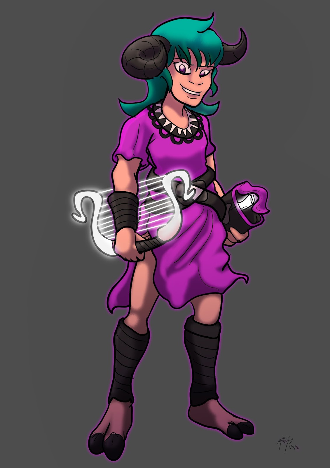
Practice: Mascot Contest for Dee-con 2016

I took the opportunity to enter the Dee-con 2016 Character mascot Contest as a way to practice designing characters.

Early Thumbnails and sketches


The concept decided to develop and I drew that character as a mature figure. 


In hindsight, I feel that the deign was out of place. In the end, the final design chosen was a mermaid that can swim in space. Although I went for the idea of mythological creatures, I feel like I could have thought more outside the box. A friend of mine suggested  that I should have done a robot design. at an early stage I did consider that.

Wednesday, 6 January 2016

Father Dagon Model Sheet Development


Rough Layout of Model Sheet

I spent some time just after the first semester working on the model sheet for father Dagon. I wanted to to use this as a form of reference for my model. At the moment, the placement of the scales on the belly are inconsistent based on this first version.


Defined Model Sheet


One of the biggest challenges I have had with this design was the mouth being on the top of the head rather than the from of the head. It was not only to fit the sea serpent illustration I used for inspiration as well as a misinterpretation of the Dagon fish god illustration, it was also used to confuse the reader, In H.P Lovecraft's other work, there are references to beings which have no definitive form such as the Shoghooth from "At the Mountain of Madness". In addition, it connects with the concepts of the familiar within the unfamiliar as I have referenced fish traits and other marine animals.
Further more there is a fear factor with the one eye and unhuman qualities of the creature's anatomy.

Tuesday, 3 November 2015

Visual Style Development:Framestore

I have considered some ideas for how the visuals could be portrayed in my comic.Since the story is told through an account by the narrator. What we could do is use the idea of how this story is being told by lettering on paper. I could make it look like it was one a story.


The tale of the Three Brothers

In Harry Potter and the Deathly Hallows Part 1 (2010), there is a scene where the Deathly Hallows are explained in the form of a fairy tale, The tale of the Three Brothers. The animated sequence is very stylized and reminiscence of a dark fable and shadow puppetry. I remembered watching this scene in a supermarket but unfortunately I could not hear the audio. Instead, I had to rely on the visuals and I under stood what was going on. what i also like is how the sequence has an overlay of a parchment texture to help enhance the idea that it was from a written story. There is colour but there are strong silhouette and lighting contrasts.The use of body language helped give me an idea of some of the charters's personality.

This link lead to the Framestore website where they discuss details about the animated sequence.
http://www.framestore.com/work/harry-potter-and-deathly-hallows-p1-tale-three-brothers

I could do this through applying existing parchment textures available online from this website.
http://www.ucreative.com/resources/40-plus-various-high-quality-free-paper-patterns-and-textures/

However I would prefer to see what I can create myself.


Here was a inked picture I made at Ryan's Inktober Event on the 27th of October.


I also included crunched up paper and some cloud effects through Photoshop to add some dampness  to the texture.


Scrunched up paper texture


Here are my attempts to adapt the Framestore style that they used during the animated sequence.


Frame Store Visual Style Test


Visual Style Tests

As you can see from the test, The silhouettes are not as effective as depicted in the animation. Therefore I will consider another approach to represent the characters. However I do admire the paper texture that is applied.

Friday, 2 October 2015

Case Study: Dagon Illustrated by Alice Duke and R,J. Ivankovic

Comic Adaptations of H.P Lovecraft's Dagon

For this study, I have chosen to pick a short story that has been adapted in to a comic book. Based on some examples I have chosen, I will look at the differences between them and how they relate to the original story. The reason I am wanting to look into this is because I have gotten quite interested in H.P. Lovecraft's work and I always wanted to retell the story in my own style. The following images are an adaption of Dagon, illustrated by Alice Duke.


Figure 1. Page 1 and 2


Figure 2. Page 3


Figure 3. Page 4


Figure 4. Page 5

Images of The Dagon Story from the Lovecraft Anthology comic (2011)

Moments

This version of the story is done in only a few pages but it does highlight the key events. The first page consists of one panel of him writing about his tale, the next one shows him escaping the occupied ship The following panel shows him in the boat on the ocean and then the last panel shows him waking up on the desolate plane. This does summaries it quite briefly and the visuals do help show a flow of what is happening. 
Frames

The gutter in this story more shows us moving form one scene to another. when the man comes across the monolith there is a transition of aspect to aspect showing us the details on the monolith then the ideas relating to the fact that is might have been worshipped by a tribe. There is a sense of consistency in this page. The panel featuring the monolith helps act as a focal point due to the glowing effect as it was described in the book.  With protagonist running back to the boat, the panels at that point in the story are border less and give us a clear suggestion that theses feeling there are the moods the protagonist is experiencing one in his head. It also suggests how fragmented his memories only, capable of capturing key elements such as the creatures face and hand.

Colour

The art style looks like it was painted traditionally with water colours.  I like the idea of how it uses a traditional painted art style because when it comes to the flashbacks it feels distorted and even a small bit faded as it is being talk from the protagonist's memories. Cool colour palette works well with the night time setting and the mixture of green and purples gives us a dreamlike and mystical atmosphere. However there is a sense of fear and wonder of the unknown. It can also suggest of the creatures otherworldly origins too. At times it even feels a bit like the character is some dream state and it could even consider that it was a all a dream.

When the main character see the beast and runs back to his boat the sequence there feels blended together a series of aspect to aspect and subject to subject transitions as it begins to become jumbled up.I like this lack of uniformed panel layouts because it helps relate to H.P. Lovecraft's theme of madness that are usually refereed through his work. It also helps connect with the line "I think I went mad then." I also like the gradient effect used when the man wakes in hospital and the the framing becomes more organised again with the white gutter. the third last panel depicts the man's visions of a what will come and here it feels like a jumble of two images. One where that sea creature is eating man and other of two crawling out of a street  grabbing some poor souls.The two images feel like figments merged together to emphasis the consequence of what is to happen.while I admire its colourful traditional painted style I still found that particular style to be difficult to see clearly. The ending itself even is unclear with what happens we are not sure if it was him imagining these things or if the entire experience was real or not. Never the less this clarity may encourage further discussion of the story. When the man comes across the chasm, it is depicted like a wide canyon whereas I always depicted it like a narrow sea canyon.

Style of Narrative

The story is told through extracts from the original story summarising the points. I have noticed the adapter did not use all of the extract and has done this as a means to condense the story and highlight the key moments.The creature is depicted as a more humanised creature but shares a few traits of fish such as the eyes, the gills and the webbed hands and feel. However it keeps a intimidating appearance with having pupil-less eyes with blue liquid emitting from its tears and sharp teeth while drooling. The eyes are glowing to emphasis its inhuman appearance and personality. It's giant scale also emphasises it's appearance. These traits help convey its scariness. The monolith is show as a large cuboid with a pyramid top similar to monuments in our world such as the Washington monument and Political Martyrs' Monument. The obelisk is white with cool colour hue that helps emit a blue glow to its surroundings.


An artist called R.J. Ivankovic produced a series of illustrations based on H.P Lovecraft's work. His 
art style is inspired by Dr Seuess. These Lovecraft illustrations feature a narrative that is very similar to how Dr Seuss structured his picture books.

 HPL's Dagon (for beginning readers) - P20-21 (DrFaustusAU 2013)

The depiction of the monolith and its carvings are in sync with the simple line art work style for the story. Despite it being not as detailed as the previous style the artists went for, I still got an idea of what it was meant to be. The monument is round that fits with the child orientated art style. The character's white colour helps make him stand out in the pictures and contrasts with the unknown surreal environment. What I also like about this style is how child friendly it looks while being based of a short horror story. The use of curves, round and the the small head body ratio shapes helps emphasis its visual appeal to a young. The is not shading just base lighting however there is a a sense of gradient certain assets. the use of the soft line work helps emphases the stickiness of the environment around him.


HPL's Dagon (for beginning readers) - P08-09 (DrFaustusAU 2012)

In this depiction of Dagon, the gutters in these two pages helps give a sense of panning across the scene. The scene is not fully cluttered and you can see what is there. There is a sense of unknown as we are just as confused as the main character is. there is small evidence of where we could be.Not only does this establish the new environment but we get a sense of wanting to know what is going on. There are decaying fish, a rowing boat with cargo and we have the main character covered in muck and slime. We get the idea that this character is a sailor because of his cap and his anchor tattoo which is a visual cue associated with the navy. 
 Dr Seuss was a author who wrote children's books that use rhythm as a form of verbal narrative.This artists has developed a style that is very similar to Dr Seuss's visual style. Ivankovic's work such as the Call of Cthulhu looks more liker something that Dr Seuss could have written as it shares similar traits. However his stories have been given further updates versions. The two example are two example of him changing styles and even story layouts and moments. The first example looks like something out of a 1920s/1930s cartoon whereas the other has some traits similar to Dr Seuss unique art style such a the way the style of shading depicted in the picture. this is shown to help emphasis the sticky texture seen in the above image.

I really like how this is a innocent retelling of a horror story in the form of a famous children's author visual and literacy style.

References

DrFaustusAU, 2012. HPL's Dagon (for beginning readers) - P08-09. [image] Available at: http://drfaustusau.deviantart.com/art/HPL-s-Dagon-for-beginning-readers-P08-09-336348560 [Accessed 8 Oct. 2015].

DrFaustusAU, 2013. HPL's Dagon (for beginning readers) - P20-21. [image] Available at: http://drfaustusau.deviantart.com/art/HPL-s-Dagon-for-beginning-readers-P20-21-353467254 [Accessed 8 Oct. 2015].

Lovecraft, H., Lockwood, D., Edginton, I., Davis, R., Hine, D., Moore, L., Reppion, J., D'Israeli., Oakley, S., Culbard, I., Stafford, M., Gallagher, L., Hartman, D. and Duke, A. 2011. The Lovecraft anthology. London: SelfMadeHero.

Lockwood, D. ed., 2011. The Lovecraft Anthology. 1st ed. London: SelfMadeHero.

Tuesday, 29 September 2015

Comic Adaption Practice Progress: Referencing, Adapting and Roughs

With the announcement of a new Star Wars movie being released in December this year, I was slowly getting into the Star wars mood. This helped me motive myself when creating practical work. To explore where I was with producing comics, I decided to start a test where I would take a scene from a screenplay that did not make it into the final film as a way to see how I can adapt a form of literacy into a visual format.

This collection of images was from one of the deleted scenes from one of the Star Wars prequels where we get to see Padme's parents. I found it to be quite interesting because the get to see more of Padme's characters in it. To me, it was like a high school girl bringing her boyfriend for dinner. Sadly it was never used because it didn't really assist the plot in any way and that the certain things which were established were already addressed in later scene. I was planning to recreate this scene as a comic page but instead I decided to make it into a single panel. 

Here are a few sketches of how I could draw the characters in the deleted scene.


Deleted Scene Characters


Screenplay Line adapted in sketch


Rendered Test


Coloured and rendered test with speech bubbles with the Komika text font.


The flow in this panel was quite poor because I was trying to follow the source material in regards to staging and camera shots. I feel that it would be more suited if it flowed from left to right in a western comic style. Furthermore speech bubble placement is one of my weakest areas when making comics.


Original Rendered Panel


Original rendered panel with flow

However as you can see here I have some changes to correct the flow. I made another attempt at this media test. This time, I took another scene from the film and recreated it in the form of a comic. I wanted to visualize a scene from the film that never made it to the final cut. I took a look at the Art of Star Wars Episode II: Attack of the Clones (2002) and found out it actually had a screenplay by George Lucas and Johnathan Hales. I noticed in some sections of the story, there were scenes that were not the original film nor the deleted scenes on the DVD. However I understand that the prequels are very flawed in acting performance and script writing. Nevertheless I I still think Its worth exploring and hopefully this test will allow me to give a little bit of character to many of these character  who were portrayed poorly in the films.


Mood board featuring screenshots from Star Wars Episode 2


Rough Sketches


Page 1


Page 2

Rough drawings of the scene

I found this practical exercise to be quite a challenging because I had some problems with keeping the style consistent including the consistent placement of objects. I kept this restricted to 2 pages.

References

Star Wars Episode II: Attack of the Clones. 2002. [DVD] Lucasfilm Ltd: George Lucas.


Vaz, M.C., Lucas, G. and Hales, J. 2002. The Art of Star Wars, Episode II, Attack of the Clones. New York: The Ballantine Publishing Group.