


This showcase features the iteration of how a character would look if they become more aligned to good or bad traits in the same way of how you can choose to be bad or good in games.


Jack's work here showed a good collection of pre-production work of his animation project.


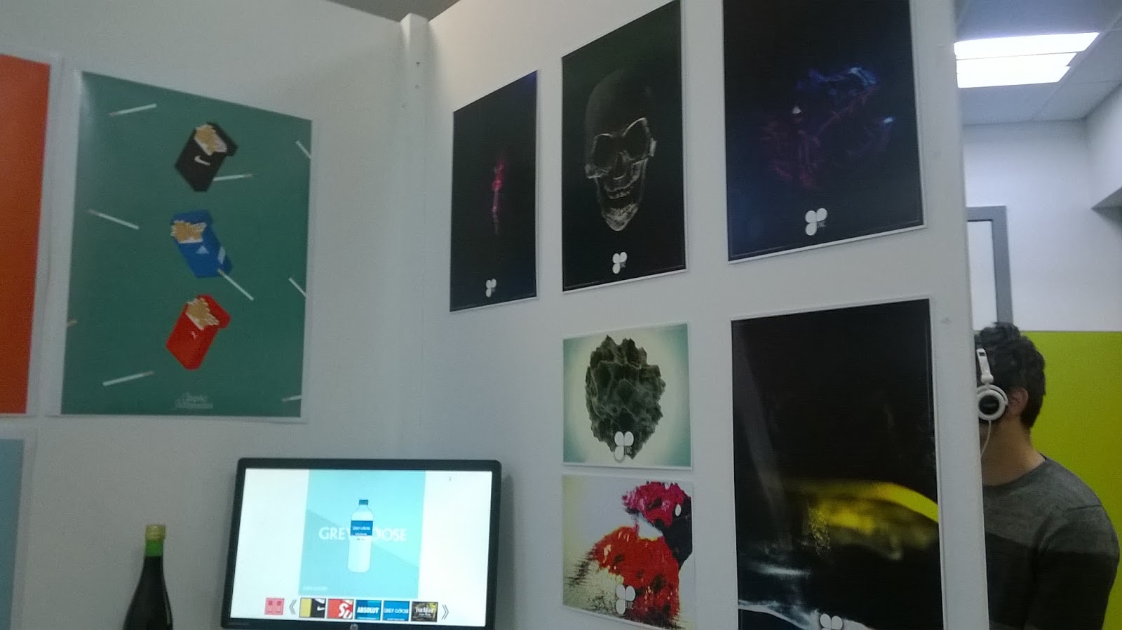
I liked Ellen Brown's strong silhouetted poster.


Photos taken from last years Graduate Showcase
Overall, the previous student's work helped give me ideas of how I can layout my work for the showcase and what documentation to put on display.
Ideally, I would like a physical copy of my comic to allow people to take a read through it. It would be beneficial for me to include a small portfolio to allow the look through my work.
One of the stall requirements is the inclusion of an A2 poster that summaries my project. During the presentation with Claire, there were a few examples of how they could look appear. Some of these were movie inspired posters and others were quite minimalist. In previous projects. I have enjoyed working on minimalist art where the shapes are simple but provide an strong impact. I liked the idea of the Jaws inspired poster where one half is the surface and the bottom half shows the monster or threat. So I took some inspiration from films that feature a deep sea threat of some kind.
I found a comic poster for a Dr Seuss inspired Lovecraft story which had a similar layout.

Dagon Front Cover (Ivankovic 2013)

Poster and Front Covers Thumbnails


Poster Iterations
This version was intended to include the monolith. However this made the sea depth look quite shallow and it did not leave a very large impact. There for this approach will not be used in the final poster design.

I like this iteration the most because we get a strong sense of scale between Father Dagon and the human. Also it is a nice homage to the jaws poster where the figure on the surface is unaware what is coming up from the depths. It allows allows a greater sense of scale for the sea.
Although the minimalist style is appealing, I'm worried in case it would drift away from my intended art style. I feel that it would be better if I went over these visuals with the loose line artwork I have applied in the comic pages. Therefore the front cover does not provide as false sense of advertising. I've seen in examples of comics where the front covers lack consistency when reading the main comics pages.
No comments:
Post a Comment